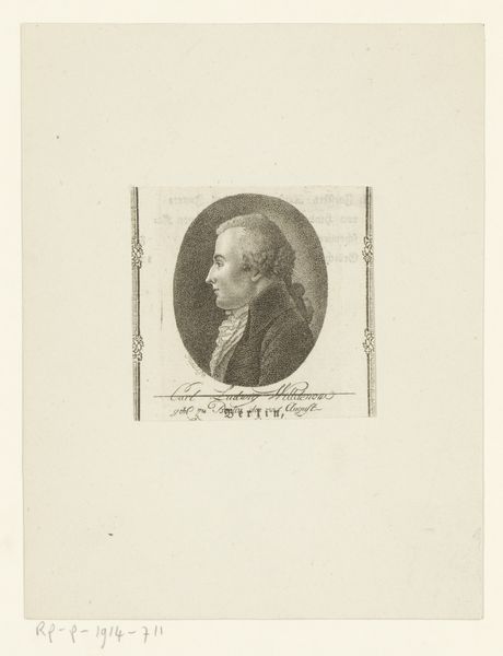
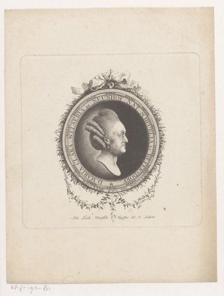
print, engraving
#
portrait
#
neoclacissism
# print
#
old engraving style
#
figuration
#
line
#
academic-art
#
engraving
Dimensions: height 214 mm, width 132 mm
Copyright: Rijks Museum: Open Domain
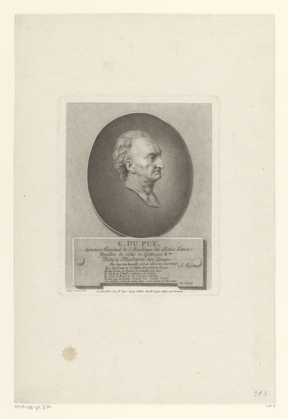
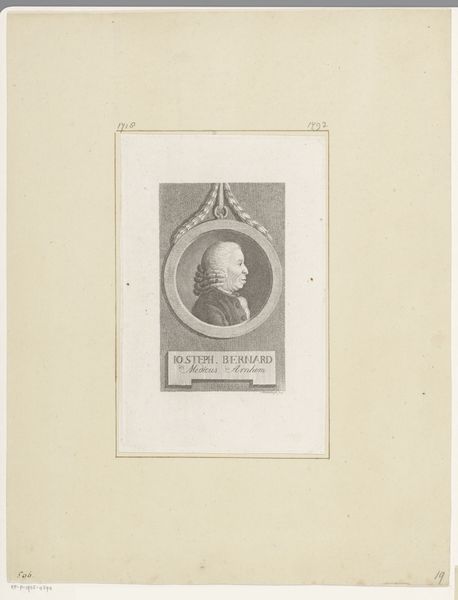
Editor: Here we have "Portret van M. de Romagne" by Jean Baptiste Vérité, a print from between 1789 and 1802. The crisp lines of the engraving create a sense of formality, even austerity. The subject’s gaze seems both direct and evasive. What aspects of the work's composition do you find most compelling? Curator: Note the stark contrast achieved through the engraved line, creating definition and form. The oval border sets the portrait apart from the linear rectangle that frames it, doesn't it? Consider the deliberate contrast, one curvature against strict, imposed lines. How does the superimposition of forms act upon our comprehension? Editor: That’s interesting! The oval softens the rigidity of the frame, making it appear less severe. But it's also creating separation, creating distance between us and the sitter? Curator: Precisely. The artist has consciously used form and shape, light and shadow to provoke our interest. Have you noticed how the directionality of the sitter's glance influences the picture space? Where does it take the eye? Editor: Towards the text beneath the portrait. So, the interplay of the image and text seems like a crucial element in experiencing this print. Curator: Indubitably. By appreciating the interplay between shape and language, we can better grasp the essence of this work. The totality relies on interrelating pictorial aspects, surely. Editor: This exercise really sharpened my view! Now, when I look at the print, I immediately focus on those dynamic contrasts. Curator: Excellent. I feel I better understand the interplay here too. Thank you for your time and perspective.
Comments
No comments
Be the first to comment and join the conversation on the ultimate creative platform.
More like this