#
neo-pop
Copyright: Keith Haring,Fair Use
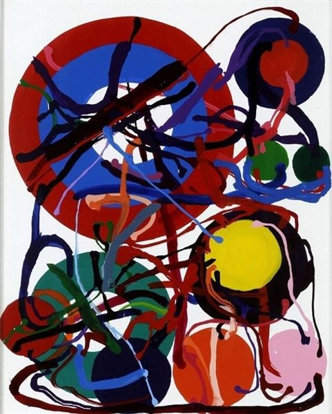
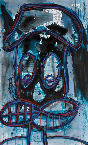
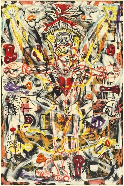
Editor: So, this is "Red-Yellow-Blue No. 15" created by Keith Haring in 1987 using mixed media. It's so visually arresting – the way the colors pop against the stark black background is captivating! The entire composition is just wild and energetic, but I'm honestly not sure what I'm looking at. What do you make of it? Curator: You know, that's the beauty of Haring, isn't it? He invites us into his world, a playground of symbols and vibrant color. At first glance, it's all energy and movement. I almost feel like I’m looking at a distorted reflection in a funhouse mirror. The simplified lines remind us of cartoons, but there's an urgency there. The color palette might suggest childlike joy, but those drips! They add an element of the raw and unfinished – even of something bleeding, no? Editor: Bleeding? That's interesting... I hadn’t thought of it that way. More like the raw spontaneity of graffiti. But the colors— why these specific ones? Curator: I see it as a symphony, darling, an anthem in acrylics. But you raise a fine point, these colors… I mean, Haring certainly embraced the Pop Art sensibility – high impact visuals meant for mass consumption. Blue, red, and yellow were his way of engaging with a universal artistic language. Did he want to signal us toward deeper symbolic layers— a warning? Editor: Maybe a reaction to the times? He was so active in the 80s, with social and political themes… I didn’t realize how multi-layered and reflective he actually was. Curator: Exactly! So many stories being told beyond those outlines and brilliant colours. Editor: Yes, such depth and complexity... far beyond the initial impression. Thank you!
Comments
No comments
Be the first to comment and join the conversation on the ultimate creative platform.
More like this