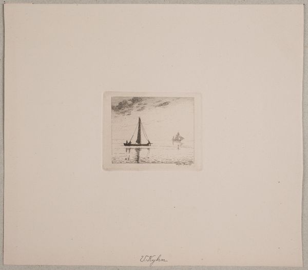
print, etching
# print
#
etching
#
landscape
#
genre-painting
#
realism
#
sea
Dimensions: height 195 mm, width 232 mm
Copyright: Rijks Museum: Open Domain
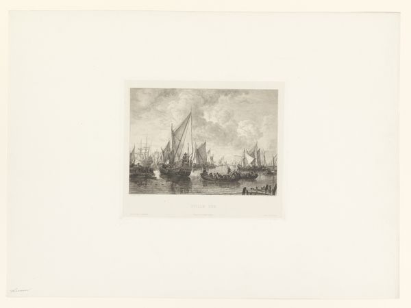
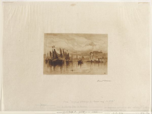
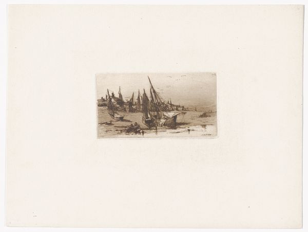
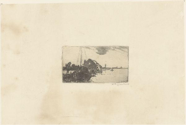
Curator: This print, created using etching, falls under the title "Zeilschepen langs de kust" – "Sailing Ships along the Coast" – and dates roughly between 1857 and 1914. The artist is Nikolay Semyonovich Mosolov. Editor: It's a somber piece, wouldn't you agree? The greyscale and hazy details convey a certain solitude despite the subject, ships teeming with life against a rather bleak sky. Curator: The contrast is quite remarkable. Note the distribution of tonal values. The lower register has deep contrasts near the waterline that fall off with height to indicate space. The upper register by comparison is quite compressed with cloud mass. The light source appears from nowhere and everywhere above. It creates a balanced composition. Editor: This composition draws on realism, wouldn’t you say? These ships must have been central to the community in his lifetime; it’s easy to imagine this imagery bolstering a national or even community identity associated with naval activities. One has to wonder the type of stories such ships carry; cargo ships perhaps? Or are these used for fishing, vital to economic activities? Curator: It appears to depict a workaday marine environment—the focus not being so much the idealized heroism of nautical adventures but a common scene involving sea travel. Note, for example, the size of figures at port in relation to the large vessels themselves. They are arranged for use and movement of goods rather than aesthetic pleasure, you see? Editor: I wonder if its intended audience understood these ships in a more romanticized manner; perhaps associating this image of daily life with adventure, access, or prosperity derived from trade? Either way, a very subtle perspective for us, indeed. Curator: And quite masterfully rendered in monochrome etching, which serves to heighten the formal values of texture and light within this simple composition of dynamic line. Editor: All things considered, what resonates most with me is its rather ambiguous, quiet strength. The bleakness emphasizes the everyday. Curator: The subtle balance creates, rather powerfully, an invitation to reflection on form.
Comments
No comments
Be the first to comment and join the conversation on the ultimate creative platform.
More like this