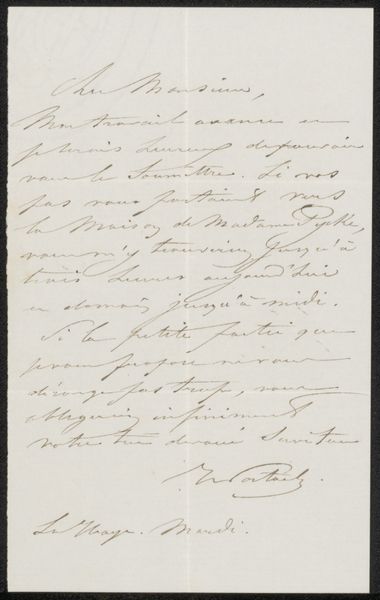
drawing, paper, pen
#
drawing
#
paper
#
pen
Copyright: Rijks Museum: Open Domain
Editor: Here we have "Brief aan Pieter Verloren van Themaat," made sometime between 1840 and 1892, artist Pieter van Wessem. It is a drawing with pen on paper. Initially, the contrast between the fine script and the stark background really grabs me. What stands out to you from a structural standpoint? Curator: The composition itself presents a fascinating tension. The eye is immediately drawn to the sweeping curves of the script, which dominate the visual field. However, note how the even spacing between the lines and the consistent weight of the pen strokes establish a rigorous, almost architectural structure beneath the seeming fluidity. It's this interplay between spontaneity and control that commands attention. Editor: That makes me think about how handwriting itself is a form of drawing. Do you see any other relationships at play? Curator: Absolutely. Observe the paper’s texture, seemingly smooth. The texture creates subtle tonal variations and catches the light differently, thereby adding a layer of visual interest. This reminds us of drawing not only as an act of writing but also as mark-making that uses materiality itself as meaning. Editor: So, you're suggesting that the choice of paper impacts the expressive qualities of the letter? Curator: Precisely. Every element, from the precise angles of the ascenders and descenders in the handwriting, the careful ordering of words, all combine to form meaning, separate from content. These details create a powerful visual and tactile experience for the viewer. Editor: I never would have considered all the elements until now, like the texture or consistency between the writing. Curator: Examining art from this point of view often reveals complexities previously unseen. We discover new perspectives that significantly enrich how we comprehend and encounter artworks.
Comments
No comments
Be the first to comment and join the conversation on the ultimate creative platform.
More like this