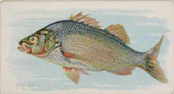
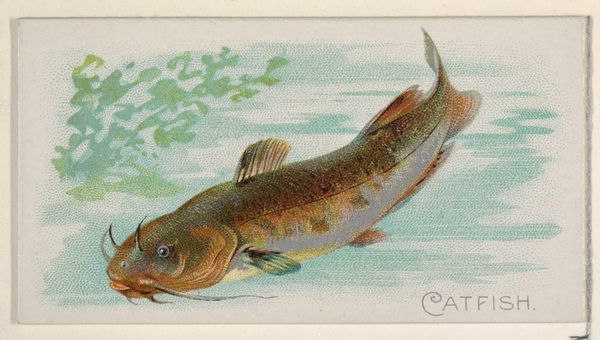
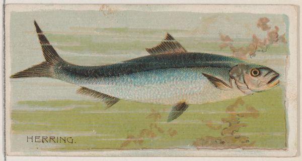
Yellow Perch, from the series Fishers and Fish (N74) for Duke brand cigarettes 1888
0:00
0:00
Dimensions: Sheet: 1 7/16 × 2 3/4 in. (3.6 × 7 cm)
Copyright: Public Domain
Editor: Here we have "Yellow Perch, from the series Fishers and Fish (N74) for Duke brand cigarettes," a lithograph from 1888 by Knapp & Company. The color palette is subtle, but it offers a striking contrast between the perch's scales and the blue background, giving a real sense of depth to the image. How do you read the structural and color elements here? Curator: Formally, note the way the composition is structured. The perch, horizontally oriented, occupies most of the frame. Its diagonal fins counter this stability, lending dynamism. The texture, created by lithographic strokes, adds layers, suggesting movement of water. Tell me, what about the juxtaposition of colors, forms and line weights leads you to your interpretation? Editor: Well, the rigid posture of the fish in contrast to the airy, pale backdrop lends a sense of heightened presence to the piece. It also draws your eye, immediately and effectively. I almost missed the hook and fishing line on the fish's mouth until a closer look. It's really fascinating. Curator: Precisely. The rigid lines and shapes form a structure which is further disrupted by this capture. Are we perhaps confronted with a meditation on tension - stillness, movement, captivity and freedom, or simply the process of visual decoding itself? Notice how the interplay of these formal devices shape the perceptual impact. Editor: It does makes you question how commercial images, even something as simple as a fish, can be far more complicated than one initially expects. Curator: Exactly, seeing is itself a method of thinking and communicating. So much of the meaning is layered in these formal choices that shape our understanding.
Comments
No comments
Be the first to comment and join the conversation on the ultimate creative platform.
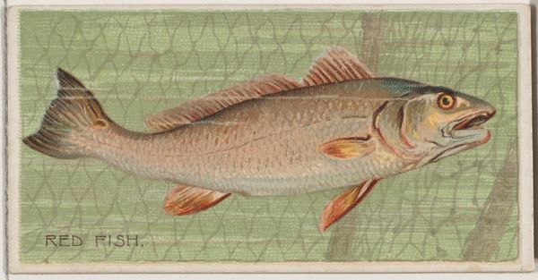
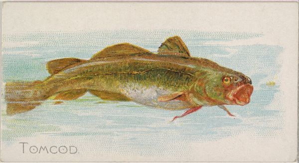
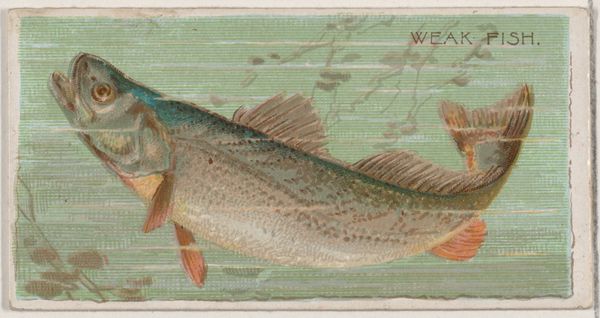
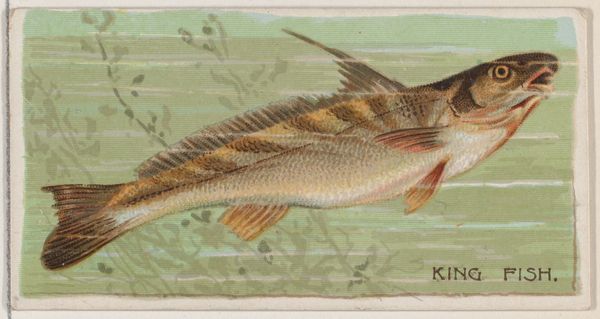
More like this