drawing, paper, ink
#
script typeface
#
drawing
#
script typography
#
hand-lettering
#
hand drawn type
#
hand lettering
#
paper
#
personal sketchbook
#
ink
#
hand-drawn typeface
#
thick font
#
handwritten font
#
small lettering
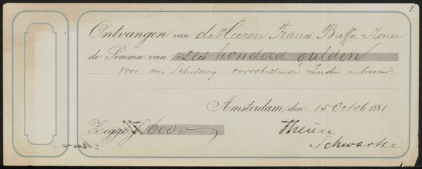
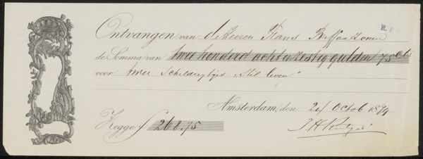
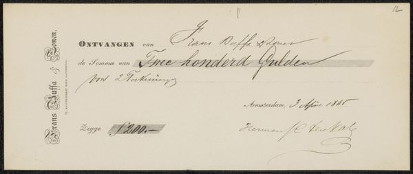
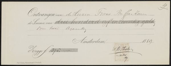
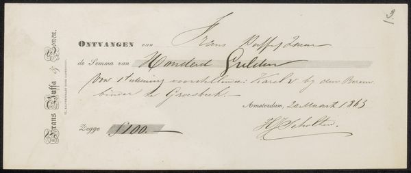
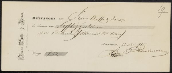
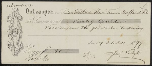
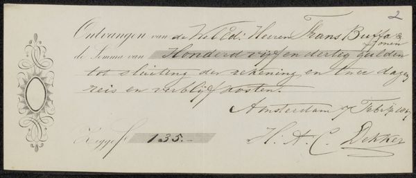
Copyright: Rijks Museum: Open Domain
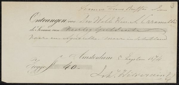
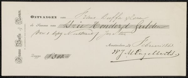
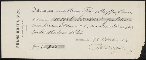
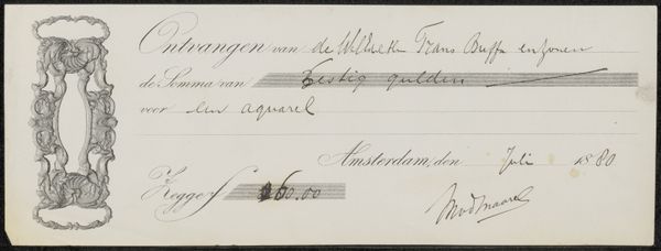
Curator: Here we have a receipt, titled "Kwitantie voor Karel Frans Philippeau," created likely between 1874 and 1878, and held at the Rijksmuseum. It’s ink on paper. Editor: Immediately, the script jumps out at me. The flourishes, the thick and thin strokes... It's almost performative in its elegance, even for a simple receipt. Curator: Indeed. It gives us a glimpse into the commercial art world of 19th century Amsterdam. Frans Buffa en Zonen were art dealers; this document likely signifies a payment made for artworks they sold, specifically watercolor paintings. Editor: The hand-lettering is remarkably consistent given the likely speed at which these were dashed off regularly. Look how the letterforms adhere to a familiar style yet still exhibit individual character! It reminds me of calligraphic exercises blending spontaneity and restraint. Curator: And it represents a specific economic interaction: Philippeau's payment to Buffa. These seemingly mundane documents can tell us much about patronage, collecting habits, and the valuation of art at the time. Receipts like these provided validation, security, and helped shape social structures. Editor: It's that tension, really, between its purely functional status as receipt and the undeniably artful execution. The weighting and contrast of strokes in the fonts creates a powerful effect overall! There is an intention and beauty in that lettering. Curator: Precisely, it embodies a time when even functional documents were imbued with a degree of artistry reflecting prevailing tastes and social standards. Every element holds historic meaning in visual culture. Editor: For me, studying this level of refinement within this functional piece sparks an important conversation around semiotics, as even mundane hand-drawn text on old receipts like this contain subtle cultural nuances and aesthetic consideration, reflective of broader visual aesthetics that are interesting to unpack. Curator: That’s where it finds its resonance: something of everyday utility that connects us to the broader cultural fabric of the era. Editor: Ultimately, there's a delightful paradox: the everyday elevated through mindful creation.
Comments
No comments
Be the first to comment and join the conversation on the ultimate creative platform.
More like this