drawing, ink
#
drawing
#
arts-&-crafts-movement
#
ink
#
line
Copyright: Public domain
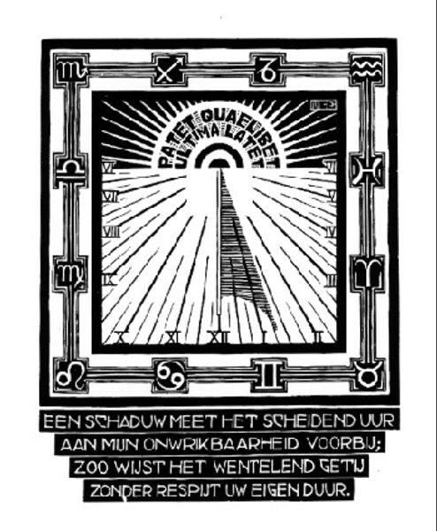
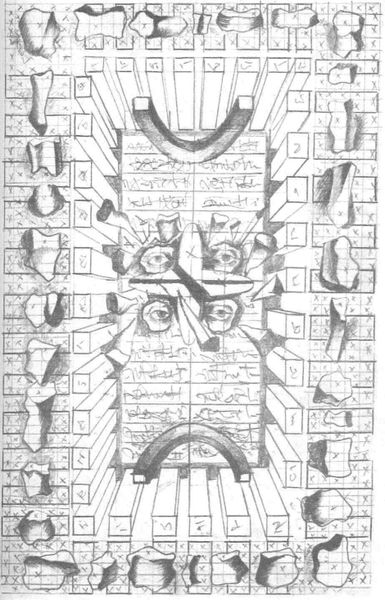
Harry Clarke made this, "The Year's at the Spring," with ink on paper. It's all about this dance of light and dark, a real back-and-forth where the details emerge from the shadows. You can see how the medium itself is part of the story here. Look at the way he renders the books, each spine a playground for texture. The ink isn't just laying there; it's built up in layers, scratched away in others, like he's sculpting the very idea of knowledge. There's a certain kind of madness to it, that’s for sure. I find it interesting how the books seem to be characters, each with a story etched onto its surface, an invitation to a secret world. Clarke's work reminds me of Aubrey Beardsley, but even more intense. There’s a sense that you are looking into some kind of personal world, as with all great art. It doesn't offer easy answers. Rather, it invites us to bring our own stories to the table and to sit with the beautiful, tangled mess of it all.
Comments
No comments
Be the first to comment and join the conversation on the ultimate creative platform.
