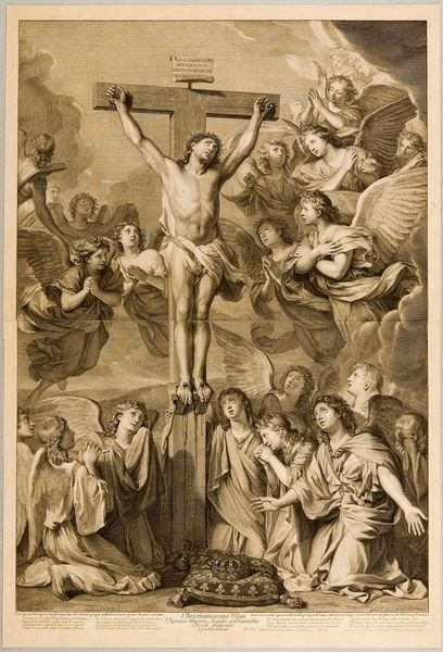
print, engraving
# print
#
landscape
#
figuration
#
form
#
11_renaissance
#
line
#
history-painting
#
northern-renaissance
#
engraving
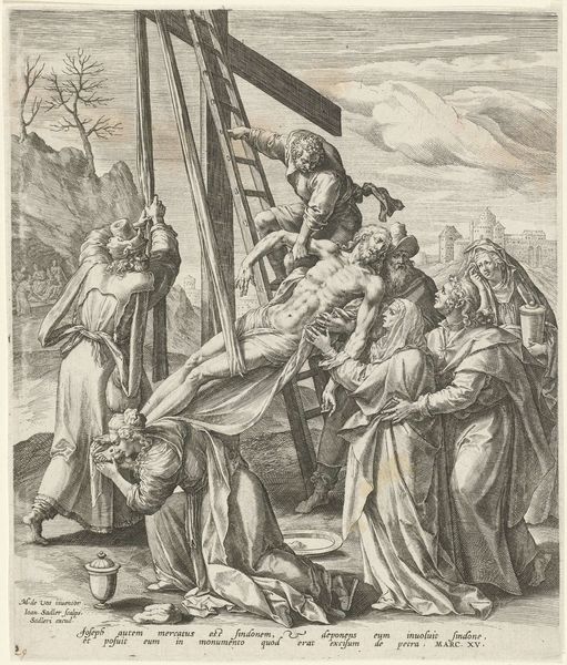
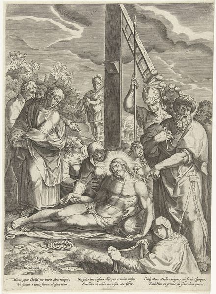
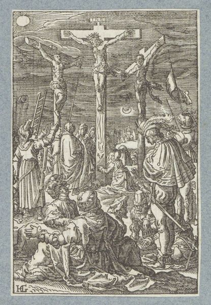
Dimensions: height 320 mm, width 406 mm
Copyright: Rijks Museum: Open Domain
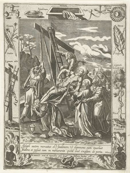
Editor: Here we have "Kruisafneming," or "Descent from the Cross," a print made by Cornelis Cort around 1565. It’s incredibly detailed, the whole scene has such a somber, heavy feeling. What stands out to you? Curator: It does have a particular gravity, doesn't it? The way the light falls, or rather, the way Cort etches the lines to suggest light – it almost feels like a stage. This isn't just a depiction of grief; it's a meditation on sacrifice. The landscape background is intriguing, a distant city, removed yet ever present, isn't it? What do you make of it? Editor: It feels… staged, yes, but also symbolic. The city's far off, as if saying this event, while impactful, is also part of something larger, almost inevitable? Curator: Exactly. Cort is playing with layers. The foreground is raw emotion, palpable loss, and behind, a stoic acknowledgement of history and faith. Consider also the text. "Peccata nostra ipse pertulit quo peccatis morti, Iustitiae viveremus.” In other words, He bore our sins, so that dead to sins, we might live to righteousness." The phrase elevates the image to an illustration of faith, offering solace amid heartbreak. See how the skull mirrors the pale face of Christ. It offers hope of rebirth through faith; isn't that remarkable? Editor: It's kind of powerful how he ties the individual sorrow to a larger, more hopeful idea. I hadn't considered that. Thanks for showing that to me! Curator: My pleasure! Every viewing reveals another layer, another story. That's the magic of art, isn't it? We see it differently each time, just as our faith evolves as well.
Comments
No comments
Be the first to comment and join the conversation on the ultimate creative platform.
More like this