drawing, ink, pen
drawing
aged paper
hand-lettering
old engraving style
hand drawn type
hand lettering
personal sketchbook
ink
hand-drawn typeface
pen work
sketchbook drawing
pen
sketchbook art
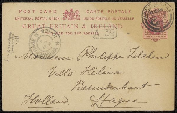
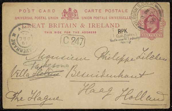
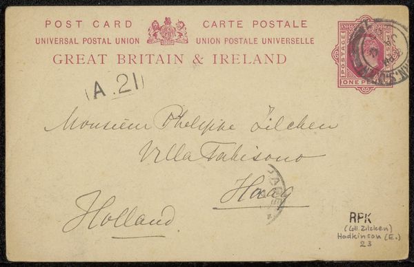
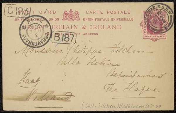
Copyright: Rijks Museum: Open Domain
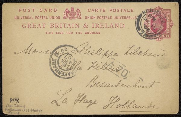
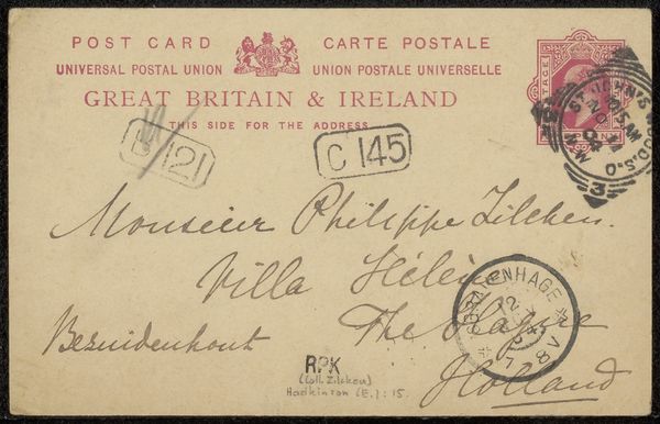
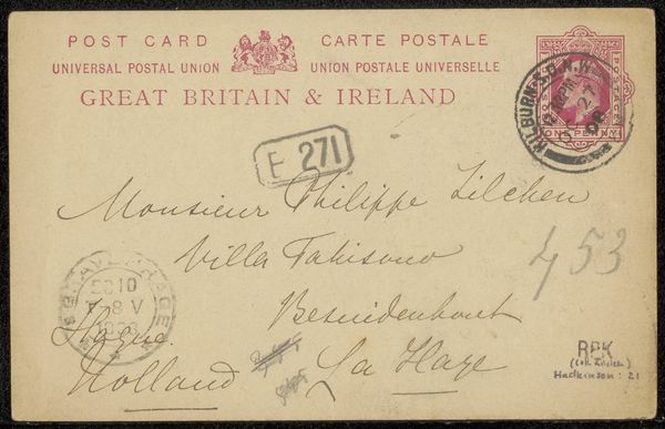
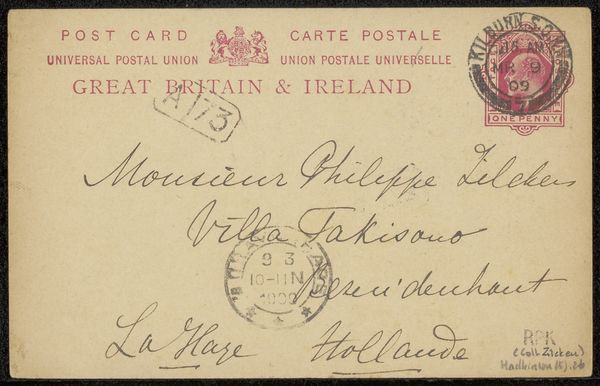
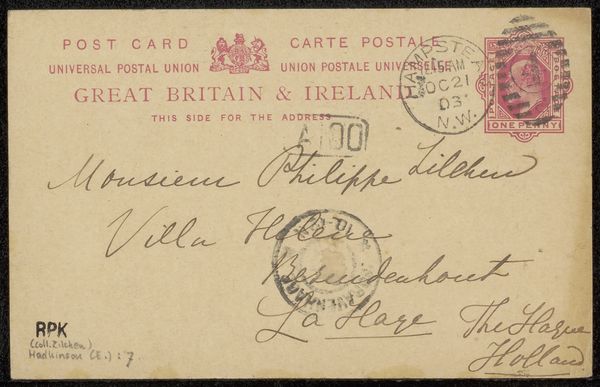
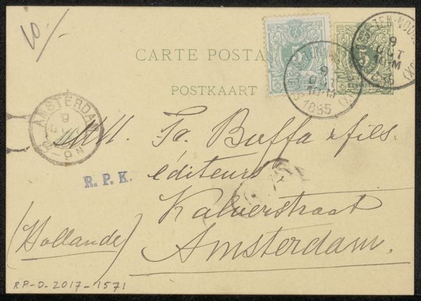
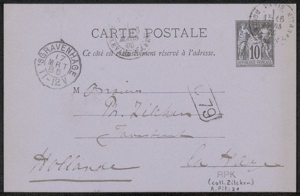
Editor: Here we have "Briefkaart aan Philip Zilcken," which translates to Postcard to Philip Zilcken, created before 1909 using pen and ink. It's striking how the handwritten text becomes the art itself. What stands out to you in this piece? Curator: Indeed. It is interesting how the inscription is given precedence over any kind of applied figuration or design. The visual texture resides entirely in the variation and character of the hand-lettering and the postal markings, a pure expression of function turned aesthetic. Consider how the composition is governed by necessity; address, return address, postage. It embraces the grid in a non-objective way, don’t you think? Editor: That’s a compelling point; the structure arises simply from its purpose. Do you think the artist’s hand-lettering brings out an aesthetic quality beyond the mere functional nature of the piece? Curator: Absolutely. Observe the deliberate strokes, the varying pressure of the pen, creating thick and thin lines. There's an inherent rhythm in the script, a kind of calligraphic dance across the aged paper, that invites a certain kind of formal appreciation. The artist seems interested in playing with type. Consider how the contrast in textures enriches the piece visually. Editor: This piece really reframes how I think about artistic composition, showing that utility and design can be seamlessly intertwined. Curator: Precisely. The materiality of the ink and paper combined with the structure creates a work of art where communication transcends the mere delivery of message and evolves into something beautiful in and of itself.
Comments
No comments
Be the first to comment and join the conversation on the ultimate creative platform.
More like this