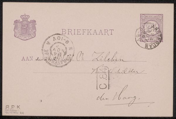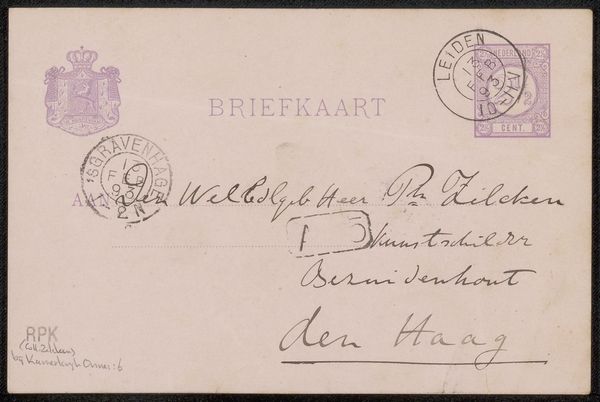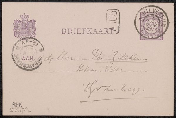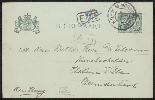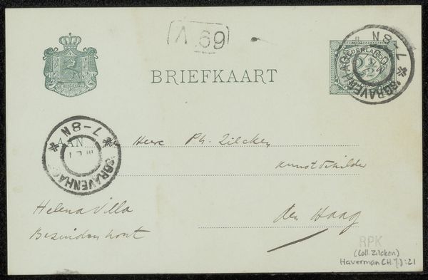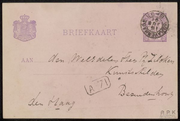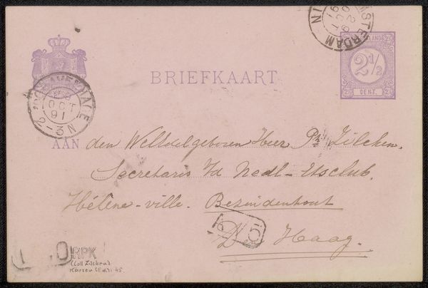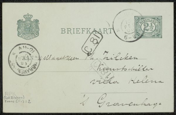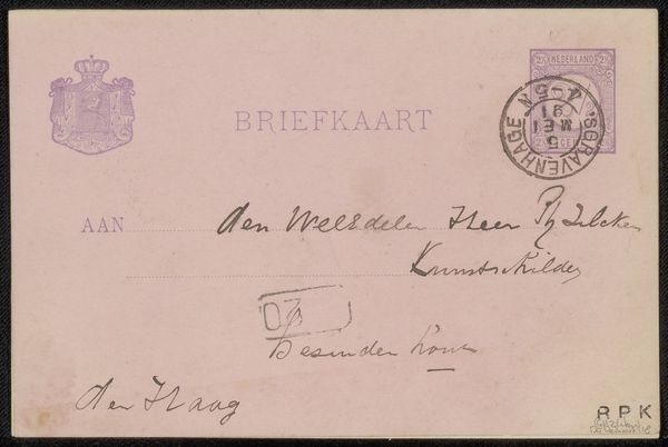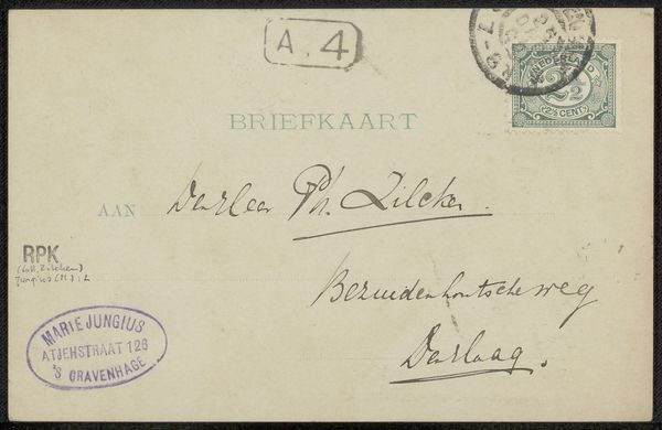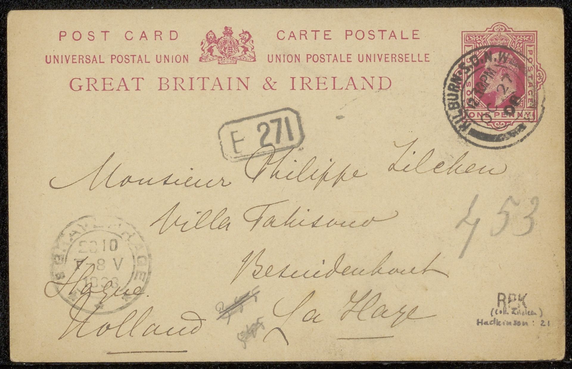
before 1927
Briefkaart aan Philip Zilcken
Listen to curator's interpretation
Curatorial notes
Editor: So, this piece is entitled “Briefkaart aan Philip Zilcken,” it's from before 1927, artist unknown. It's ink on paper; a simple postcard, really. I'm struck by the composition. The handwriting is quite beautiful and dominant. What do you see in this piece, beyond its obvious function? Curator: Primarily, I am drawn to the interplay of textures. Notice how the smooth surface of the paper contrasts with the delicate, almost frantic, lines of the ink. The placement of the stamp, that square of geometric intensity, further enhances this relationship, fracturing the surface into distinct visual planes. It becomes not just a postcard, but an orchestration of visual elements. Editor: Frantic, yes, but there’s a controlled element to it as well. It appears carefully written, especially “Monsieur Philippe Zilcken,” perhaps an exercise in penmanship as much as correspondence? Curator: Precisely! This tension between spontaneous expression and deliberate formation is at the core of the piece's visual interest. Look at how the curves of the letters echo and respond to each other across the surface. Even the seemingly haphazard postmarks contribute to the overall dynamic, punctuating the flow of the text. Consider the semiotic weight of the postal markings, how the text of 'Great Britain' clashes and competes with the address's handwritten style. Editor: It’s interesting how analyzing the components independently gives a greater sense of appreciation for the work as a whole, rather than reading the address right away. Curator: Indeed. The layers of formal examination bring nuance. Editor: I'll keep that in mind in the future, that attention to detail can inform a piece in interesting ways.