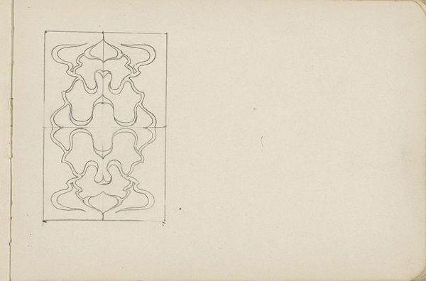
drawing, graphic-art, paper, ink
#
drawing
#
graphic-art
#
art-nouveau
#
pattern
#
paper
#
ink
#
geometric
#
abstraction
#
pattern repetition
Dimensions: height 280 mm, width 220 mm
Copyright: Rijks Museum: Open Domain
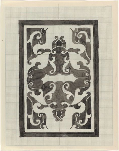
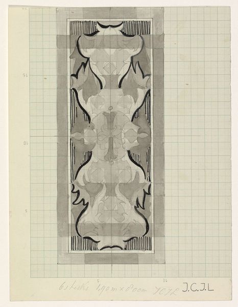
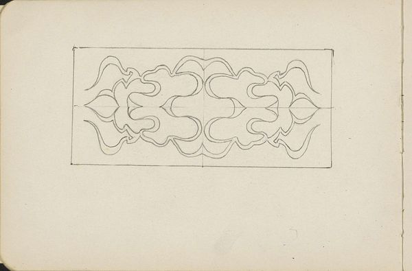
Curator: Well, this ink drawing by Carel Adolph Lion Cachet is called "Decoratief ontwerp" and dates sometime between 1874 and 1945. What do you make of it? Editor: It strikes me as a rather calming piece. The monochromatic palette and symmetrical composition lend a sense of visual order, wouldn’t you agree? Curator: Absolutely. And I think it speaks to a significant trend of the period—this intense drive toward making art part of everyday life. Cachet's decorative design could be translated onto wallpaper, textiles, even architectural details. Editor: Indeed, the curvilinear forms and rhythmic repetition, hallmarks of Art Nouveau, create a visual harmony. But beyond mere decoration, the composition, almost cruciform, suggests a deeper symbolic order at play. Curator: That’s an interesting read. Contextually, this era witnessed burgeoning industrialization and a growing middle class with increasing access to consumer goods and visual culture. Designs like this aimed to elevate the aesthetic quality of mass-produced items. It became a political project too. Editor: I see your point about elevating mass produced items, yet the very controlled gradation of tone seems key. Observe the contrast between the defined frame, for instance, and the more softly shaded forms. I see intention to play on positive and negative space that adds complexity. Curator: Definitely. But who determined that elevated taste? These sorts of "decorative reforms" were frequently backed by the elite hoping to quell working-class unrest and reassert bourgeois values through "good" design. It raises questions of power. Editor: Fair enough. Yet one cannot deny the underlying structure gives coherence to the entire work. This framework emphasizes its pure, abstract design elements rather than conveying narrative, which invites pure contemplation. Curator: A compelling, thought-provoking example of the period’s aspirations and contradictions. Editor: I agree! Seeing how historical factors play out at the same time as the sheer visual depth it adds is really eye opening.
Comments
No comments
Be the first to comment and join the conversation on the ultimate creative platform.
More like this