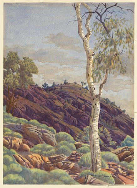
watercolor
#
landscape
#
watercolor
#
naive art
#
watercolour illustration
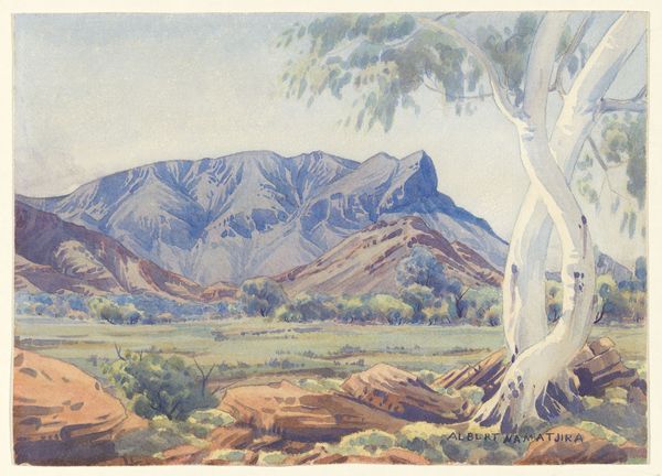
Copyright: Albert Namatjira,Fair Use
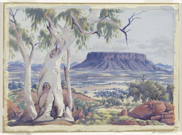
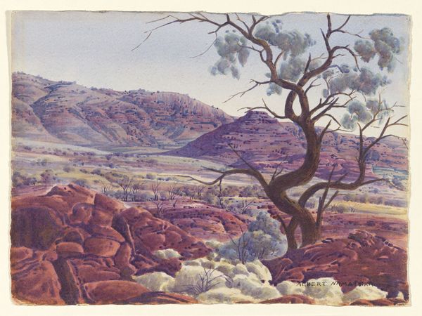
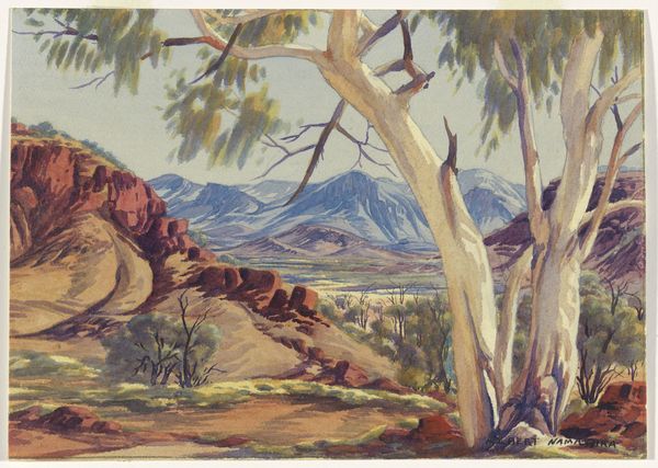
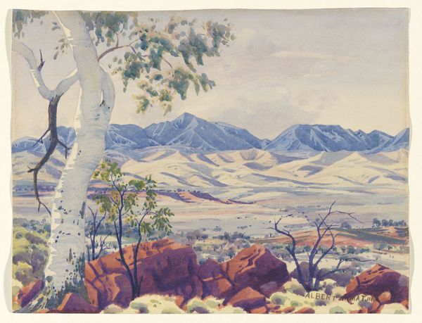
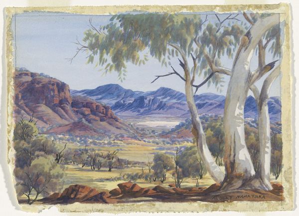
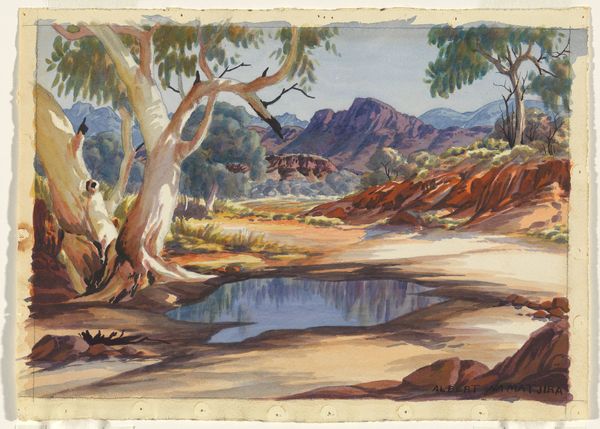
Editor: This watercolour from 1951 is called "Untitled (Hermannsburg Watercolour)" by Albert Namatjira. The composition seems so well-balanced, a kind of structured harmony, but the palette is a little muted. What do you see in this piece, focusing on those formal qualities? Curator: Indeed. Consider the way Namatjira has used receding planes, establishing depth through a clear foreground, middle ground, and background. The application of colour contributes significantly; notice how the blue-grey of the mountains recedes in contrast to the warmer, earthy tones in the foreground. Editor: Yes, the colours definitely seem to separate out the composition's planes. What about the relationship between the solid and open spaces – like that prominent tree on the left versus the broader vista behind it? Curator: Precisely! The strong verticality of the tree introduces a counterpoint to the horizontal expanse of the landscape. Consider how the artist uses a limited palette to achieve depth and spatial recession. It's quite accomplished given its ostensible simplicity. Do you see the use of line as a method of achieving a certain form? Editor: Definitely. Especially in those striking mountains! They dominate the piece not only with their size but through very definite, precise line work. What strikes me most is how the subdued colors contribute to its overall serenity, in spite of those quite rigid formal elements. Curator: An excellent observation. This piece underscores how crucial line and form are in evoking emotional response, proving colour isn't the only vehicle for mood. Editor: It's been so insightful seeing how the elements interact. I’m off to go study colour theory now!
Comments
No comments
Be the first to comment and join the conversation on the ultimate creative platform.
More like this