drawing, paper, watercolor
#
drawing
#
pattern
#
paper
#
watercolor
#
watercolour illustration
#
watercolor
Dimensions: overall: 28.6 x 22.9 cm (11 1/4 x 9 in.) Original IAD Object: 33" long; 35" wide
Copyright: National Gallery of Art: CC0 1.0
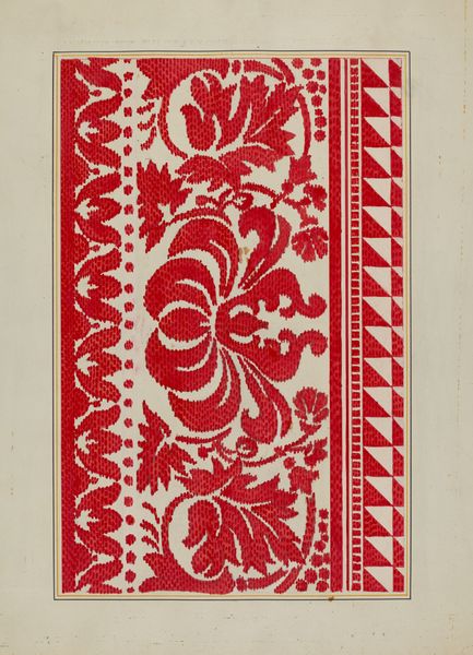
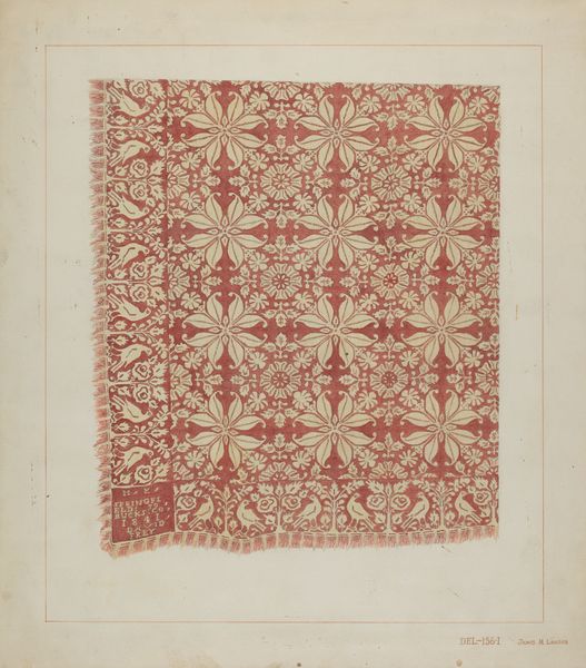
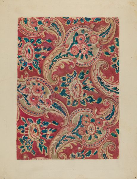
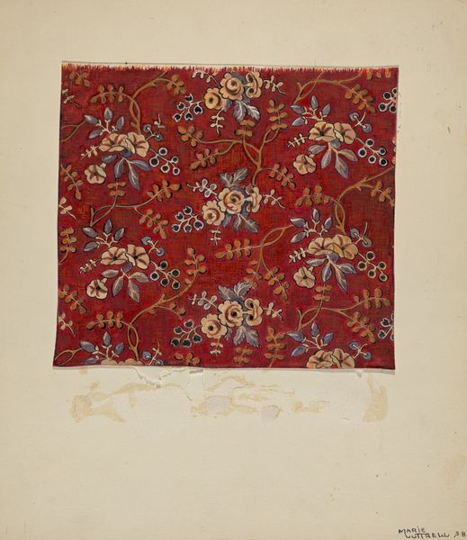
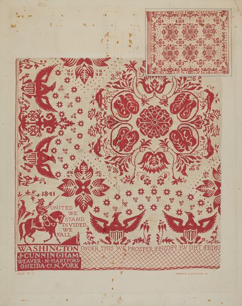
Editor: Here we have Isabelle De Strange’s “Kerchief,” circa 1936, a watercolor and drawing on paper. The overall red hue and dense floral patterns make it feel both vibrant and intricate to me. How do you interpret this work, focusing on its formal qualities? Curator: The composition relies heavily on repetition and symmetry. Note the geometric layout. A central, densely patterned square is framed by equally ornamented borders at the top and sides. It lacks a fourth border at the bottom, drawing attention to its function as a design element. Observe the palette - a limited range of reds, blacks, and whites which work to establish a visual rhythm and spatial order within the two-dimensional plane. What stands out to you about how De Strange utilizes line? Editor: The lines are delicate yet precise, defining the floral motifs and separating the different areas. The tiny dots, used especially around the border's edges, almost give a stippled texture. I also notice the lack of shading creates flat planes of color. Curator: Exactly. That deliberate flattening emphasizes the overall design rather than depth or volume. We see the design vocabulary prioritize surface ornamentation. The eye isn’t invited into an illusory space, but rather is encouraged to appreciate the inherent qualities of the material itself. Consider also the artist’s choice to reveal the unpainted paper surrounding the kerchief, highlighting the edge as part of its construction. How does it shape your experience of the piece? Editor: It does reinforce the sense of this as an object, a design sample, not a depiction of a kerchief but a proposal. It makes me focus more on the elements and the way they come together. Curator: Precisely. In recognizing and interpreting such stylistic choices, we see De Strange's approach prioritize an engagement with the visual elements themselves to unlock meaning, shifting our gaze towards form and materiality above all else. Editor: Thank you, seeing it that way highlights just how carefully the artist considered the relationship between color, line, and pattern. It also underlines the effectiveness of its formal components in establishing its distinct design identity.
Comments
No comments
Be the first to comment and join the conversation on the ultimate creative platform.
