drawing, print, graphite
#
portrait
#
drawing
#
negative space
# print
#
graphite
#
academic-art
#
realism
Dimensions: height 250 mm, width 176 mm
Copyright: Rijks Museum: Open Domain
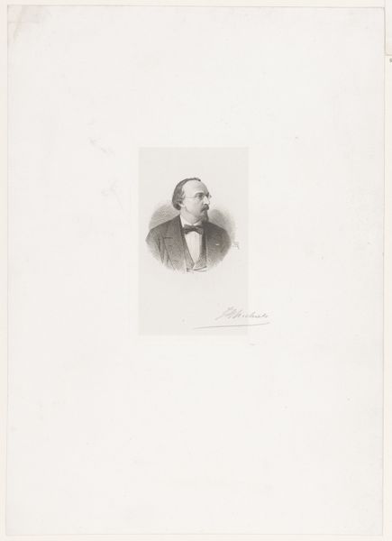
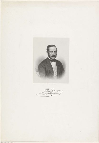
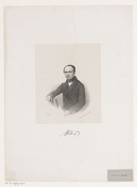
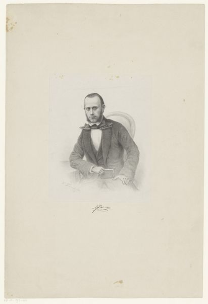
Curator: Here we have a drawing by Christiaan Lodewijk van Kesteren from 1873, titled "Portret van Jan van Beers." It's rendered in graphite, and we see it's actually a print. You can find it here in the Rijksmuseum's collection. Editor: You know, there's a vulnerability there in those graphite lines that's strangely moving. All that white space around him…makes him seem kind of exposed. It’s intimate, even. Curator: That intimacy certainly aligns with the artistic currents of the time, which saw the rise of Realism in portraiture, eschewing overt idealization for a more grounded portrayal. Editor: True. Though his pose and the stiff formality of the jacket, waistcoat and bowtie, do lend a certain stuffiness...like the artist knew that this drawing would have to somehow speak across generations! Curator: Precisely! It also served as a means to construct and broadcast an image of success, particularly for artists navigating the burgeoning art market. A carefully constructed public persona was crucial, you see. Editor: And here is "Jan van Beers", as if paused between thoughts, contemplating what to do next in that bustling art world you are talking about. This drawing could actually tell his own story as an artist: an act of branding! Curator: That is absolutely spot on! Think about the way portraits circulated within artistic circles as gifts, tokens of admiration, even strategic self-promotion... All this was building an artistic reputation and all the politics behind. Editor: So it isn't *just* a drawing. Curator: Indeed. And notice how his signature almost grounds him to the paper. It gives the drawing context and authenticity. Without it, there's nothing anchoring him there, and the whole thing drifts off to float aimlessly! Editor: Well, I find it floats just perfectly! But thinking about it now, those firm signature strokes *are* very beautiful, offering balance and acting as counterweight to the negative space that surrounds him. I keep feeling this work is not static! Curator: In that sense, what strikes me is the convergence of artistic technique and historical moment; the portrait reveals just how calculated those first-impression strategies really were. Editor: Which then invites us, here, today, to perhaps re-interpret or counter them.
Comments
No comments
Be the first to comment and join the conversation on the ultimate creative platform.
More like this