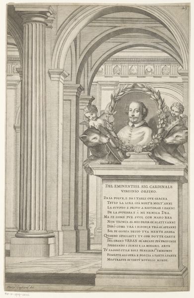
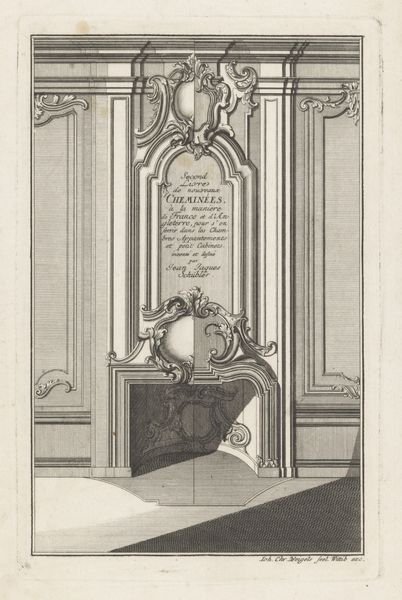
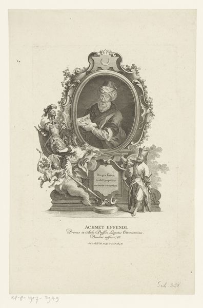
print, engraving, architecture
#
portrait
#
baroque
# print
#
old engraving style
#
figuration
#
history-painting
#
engraving
#
architecture
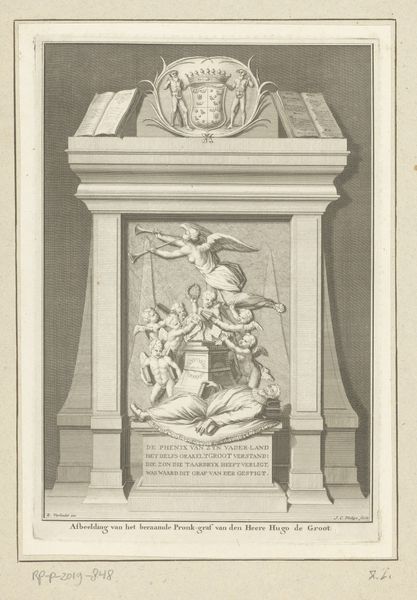
Dimensions: height 338 mm, width 224 mm
Copyright: Rijks Museum: Open Domain
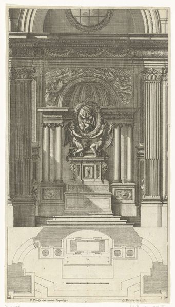
Curator: What strikes me first is the sheer graphic quality – the sharp lines and the contrast between the architectural elements and the softer portrait. It feels very dramatic. Editor: Indeed. This engraving, dating back to 1642, is titled "Monument voor kardinaal Marco Antonio Franciotti". You can find it here at the Rijksmuseum. What is particularly compelling is how the built form serves as a commemoration, effectively merging architecture and memorial. Curator: Absolutely. The architectural elements are fascinating in their own right. Look at the perspective, for instance – the receding arches draw the eye deep into the image. The level of detail achieved through the engraving process is extraordinary. How does the choice of architecture itself function? Editor: Given the cardinal’s position, it is likely that the design references contemporary trends in Baroque church design. The epigram on the plaque offers additional meaning to be revealed. The monument may function to immortalize the figure and express cultural power, considering also that its presence as an engraving allowed the artwork to disseminate this cultural power beyond any local monument itself. Curator: Right. The contrast is especially interesting when you compare it to the cardinal's portrait. He appears more delicate than the hard marble surrounding him. It begs the question, what kind of labor went into translating the likeness into the image? And, thinking more broadly, what statement is being made through this carefully crafted object, a reproducible and, hence, a distributable image? Editor: The materiality of the print certainly dictates our perception. The medium limits detail but accentuates the formal aspects of shape and line, leading to that distinct emotional power, that dramatic flair we noted initially. Curator: I think focusing on those lines really tells us something about the impact of production and how the Baroque as a global style gained prominence by way of distributed works like this one. Editor: Precisely, each perspective adds to the appreciation of a piece like this.
Comments
No comments
Be the first to comment and join the conversation on the ultimate creative platform.
More like this