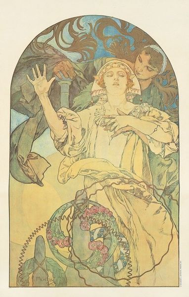
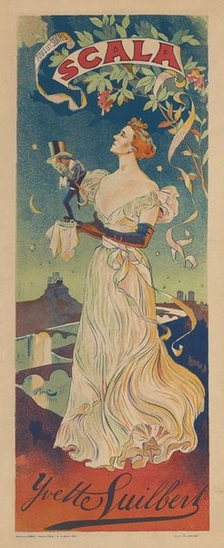
poster
#
pop art-esque
#
cartoon like
#
cartoon based
#
egg art
#
caricature
#
pop art
#
yellow element
#
bubble style
#
cartoon style
#
cartoon carciture
#
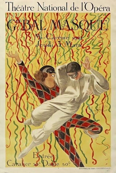
poster
Copyright: Public Domain: Artvee
Curator: Ah, here we have Adolfo Hohenstein’s 1899 poster, “Chiozza e Turchi, fabricants de savons, Pontelagoscuro, Italie”. A rather exuberant advertisement for a soap manufacturer. Editor: It’s whimsical! The flowing lines, the glowing bubbles... almost dreamlike, but definitely selling something. What a striking juxtaposition of commercial intent and high art sensibility. Curator: The composition relies heavily on curvilinear forms. Notice how the lines of the women’s bodies echo the swirling foam, which in turn integrates with the decorative, bordering motifs at the base. The use of analogous colors – the greens, yellows, and muted blues – further unifies the design. Editor: It is an interesting representation of commercial art, as popular imagery was clearly vital to social life. Advertising wasn't just about selling products; it was a means to disseminate cultural ideals, particularly representations of beauty and domesticity. How interesting that it focuses on women making soap, perhaps indicating an association with the home. Curator: The subject certainly draws on pervasive Art Nouveau tropes. Look at the idealized figures, reminiscent of classical nymphs or goddesses, interwoven with the swirling, organic shapes of the soap foam and the bubbles. He subtly embeds classical motifs with his new vision. Editor: And it functioned as a democratizing force; advertisements like these transformed urban spaces, becoming readily accessible, ubiquitous forms of visual communication for individuals from diverse socio-economic backgrounds. Think how such an image, plastered across Pontelagoscuro, might have informed the everyday aesthetic experience. Curator: You're spot on about its role. Considering it's a poster, the materiality also invites analysis. The texture and sheen of the original print would have affected the way viewers interacted with the piece on a very tactile level, giving an inherent richness to the overall experience. Editor: Its placement and integration with public spaces allowed for constant renegotiation between art and daily life, blurring perceived limits of production and experience. That the artist was able to use advertising to promote Chiozza e Turchi is still effective today. Curator: Yes, this has made me appreciate even more how structure and placement enhance that semiotic and artful reading. Editor: And seeing how these ads mirror our cultural evolution definitely sheds new light on both then and now.
Comments
No comments
Be the first to comment and join the conversation on the ultimate creative platform.
More like this