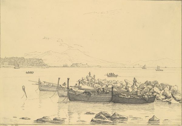
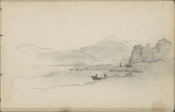
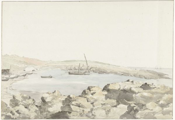
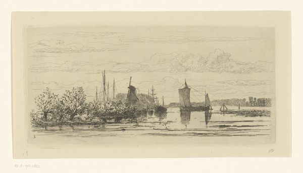
Castel del'Uovo aan de golf van Napels met roeiboten op het water 1788 - 1839
0:00
0:00
hendrikvoogd
Rijksmuseum
drawing, pencil, architecture
#
drawing
#
neoclacissism
#
landscape
#
pencil
#
architecture drawing
#
cityscape
#
architecture
Dimensions: height 448 mm, width 577 mm
Copyright: Rijks Museum: Open Domain
Curator: Looking at Hendrik Voogd’s pencil drawing, "Castel del'Uovo aan de golf van Napels met roeiboten op het water," dating between 1788 and 1839, I’m immediately struck by the almost ethereal quality of the scene. The stark monochrome emphasizes the geometric layout of the landscape and architecture. What is your first impression? Editor: It's understated, isn’t it? Restrained almost. The lightness, the subtle variations in tone, and the hazy distance, all seem to drain any political or emotional urgency. I suppose it could also reflect a feeling of alienation being displaced from the land. It almost feels unfinished or dreamlike. Curator: That feeling of detachment you mentioned resonates given Voogd's biography. He was, after all, a Dutch artist working within the Neoclassical movement, creating this scene of Italy. He was undoubtedly an outsider observing the societal structures. It can almost be said that his neoclassical background and training reflects that of French society during and following the French Revolution. What visual clues can you observe? Editor: The composition definitely adheres to classical ideals. The clear recession into space, achieved through carefully calibrated gradations in tone and delicate, minimal pencil strokes, creates depth without dominating. He also uses the architectural skyline as a subtle horizontal divider of the scenery, balancing both the composition, but also the reality and its ethereal reflection. Curator: Absolutely, that carefully constructed depth is crucial to the overall meaning. Also note the roeiboten of the water in proximity with Castel del'Uovo, that seems to provide a contrast to Voogd's identity of observing "the other," he can still identify and familiarize with others working class people during that era. There’s a sense of order imposed upon nature. And the pencil itself—the conscious decision for it as a medium—what does it communicate about identity and representation here? Editor: The choice of pencil provides the image with simplicity and refinement, also highlighting a detachment from the culture during this moment in time. The pencil marks themselves aren’t heavy, almost fading the water and other materials and not reflecting their real identities. Also the limited values create the image itself with reduced substance. Curator: That focus, paired with what you called the sense of understatement, might just reveal more about how Voogd wanted to situate his position on society—through subtle details of line, tone, and compositional arrangement of its time. It seems he wanted the viewer to question and examine how society may affect a particular individual, and it's possible feelings alienation towards one's culture. Editor: The use of light provides with feelings of detachment. And by extension the lack of darker lines of pencil values do add to his persona and narrative. Thank you for elaborating with an incredible perspective and historical overview of Hendrik Voogd and his vision.
Comments
No comments
Be the first to comment and join the conversation on the ultimate creative platform.
More like this