drawing, graphite
#
drawing
#
landscape
#
natural light
#
graphite
#
realism
Dimensions: height 244 mm, width 383 mm
Copyright: Rijks Museum: Open Domain
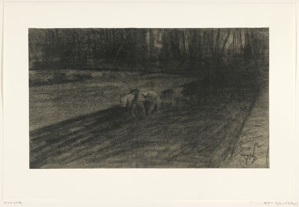
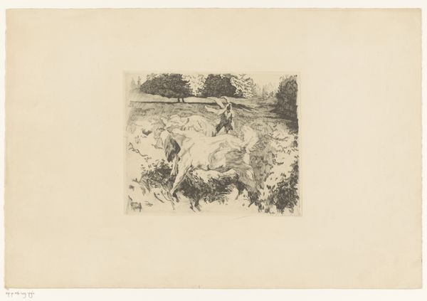
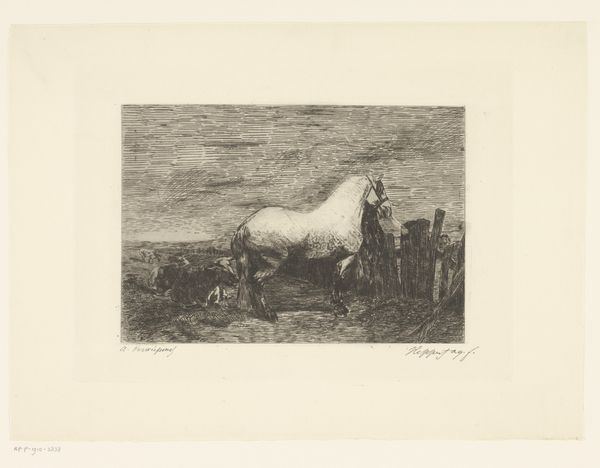
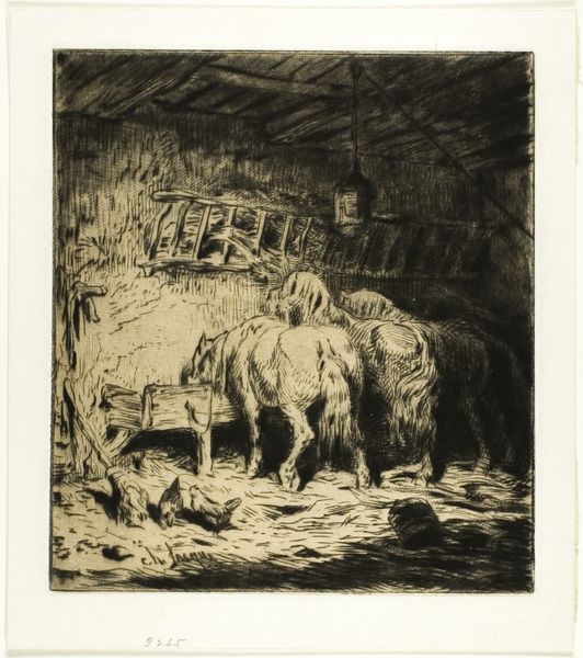
Editor: Here we have Maurits van der Valk’s “Paarden voor een wagen,” or “Horses before a wagon," done sometime between 1867 and 1935, using graphite. It feels very subdued, almost like a memory. What strikes you about the composition? Curator: The formal relationships are quite compelling. Note how van der Valk uses graphite to explore a spectrum of tonal values. The chiaroscuro effect creates a dramatic interplay of light and shadow, emphasizing the contours and textures. How does this affect your perception of depth and space? Editor: It definitely makes it feel less flat. The darker tones seem to push the wagon into the background. I notice, though, how the horses themselves lack very fine detail. Curator: Precisely. Consider how van der Valk simplifies form, favoring suggestive strokes over meticulous detail. The drawing’s strength lies in its orchestration of light and mass, more than mimetic representation. Is the expression more abstract than a detailed drawing? Editor: Yes, you’re right! Focusing less on the details allows it to have this open and subtle reading that suggests more than it tells. I wouldn't have picked up on those formal elements if you hadn't pointed them out. Curator: And by understanding that tension between form and representation, we gain a much greater appreciation for the intention. Editor: Agreed, thanks for pointing that out, that really highlighted an alternative reading.
Comments
No comments
Be the first to comment and join the conversation on the ultimate creative platform.
More like this