painting, acrylic-paint
#
narrative-art
#
painting
#
landscape
#
acrylic-paint
#
russian-avant-garde
Copyright: Public domain
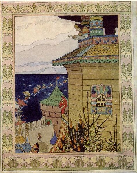
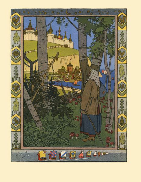
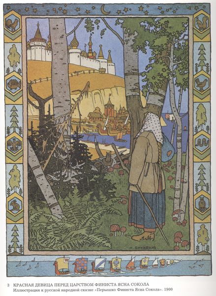
Editor: Here we have Ivan Bilibin's illustration for the Russian fairy tale "White Duck", which looks to be executed in acrylic paint, evocative of the Russian Avant-Garde movement. The composition is remarkably layered and decorative. What strikes you most about this particular illustration? Curator: I observe a fascinating tension within the composition. Notice the prominent architectural forms dominating the right foreground juxtaposed against the implied vastness of the sea and sky to the left. The border acts as a frame, reinforcing the flatness of the picture plane, further enhancing this contrast. How do you interpret the effect of that duality? Editor: I hadn't thought about it that way, but it definitely gives the scene a sense of contained grandeur. Almost like looking out from a stage set. I also find myself wondering about the figures placed so high up in the architecture. Curator: Indeed. The artist is manipulating pictorial space to create symbolic resonance. We might also explore how Bilibin employed decorative stylization—especially that defined edge that seems to control all forms—as a method of pictorial organisation and surface articulation in place of more expected modes such as chiaroscuro or sfumato. Notice too how even light from the top left highlights the architectonics of design itself, and in turn this very visibility and foregrounding seems to make these design features into characters that are integral to the story this painting would illustrate. Editor: So, by focusing on design elements over, say, accurate depth, Bilibin almost elevates the composition into a character within the narrative? That’s fascinating! I initially just saw decorative intent, but now I recognize his strategic decision. Curator: Precisely! By privileging surface design as meaning, we gain deeper access to a cultural context rooted in folk traditions. Perhaps, these were choices made for reproduction on a printed page, or they might have also alluded to something more that could affect and inform our encounter. What do you make of it?
Comments
No comments
Be the first to comment and join the conversation on the ultimate creative platform.
More like this