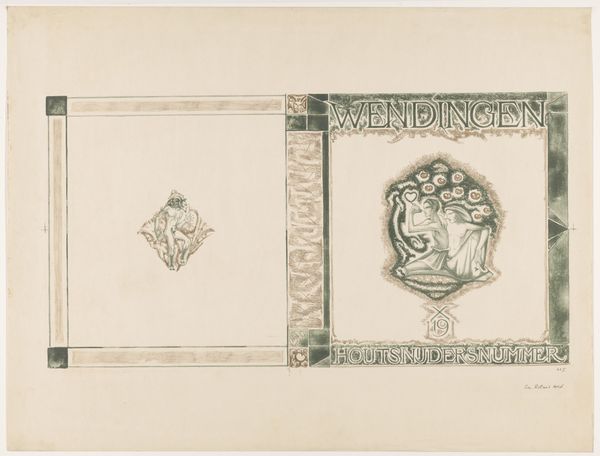
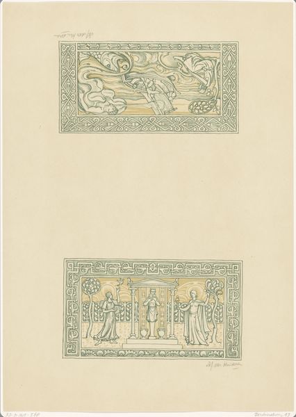
Ontwerp voor een boekomslag voor een uitgave van Symfonie nr. 8 van Gustav Mahler 1875 - 1932
0:00
0:00
graphic-art, typography, poster
#
graphic-art
#
natural stone pattern
#
art-nouveau
#
pattern
#
pattern background
#
pattern design
#
typography
#
repetitive shape and pattern
#
ethnic pattern
#
organic pattern
#
geometric
#
repetition of pattern
#
vertical pattern
#
pattern repetition
#
decorative-art
#
layered pattern
#
poster
Dimensions: height 225 mm, width 298 mm
Copyright: Rijks Museum: Open Domain
Curator: This image presents a design for a book cover meant to accompany a performance of Gustav Mahler's Symphony No. 8. Its creator, Annie Ermeling, worked on it sometime between 1875 and 1932, likely during the peak of Art Nouveau. Editor: My immediate impression is how calming the overall design feels despite its ornamental details. The olive-green background provides a tranquil foundation, allowing the off-white and coral details to stand out with gentle elegance. Curator: And consider how the cover highlights the "Maatschappij tot Bevordering der Toonkunst," or the Society for the Advancement of Music, which sponsored the concert. The typographic choices, typical of the era, communicate a sense of prestige. Editor: Absolutely. We should also note the geometric composition with layers of nested rectangles. Notice the intricate borders; they draw the eye inward. Also, the lyre on the left cover panel is a quintessential symbol of music. The pattern with fleur-de-lis-like figures beneath the text fields subtly alludes to cultural heritage. Curator: From an activist lens, these societies often represented the cultural elite, perpetuating inequalities in access to the arts. The visual language—the heraldic emblems and formalized typography—reinforces this hierarchy. Editor: The symmetry of the layout creates a formal structure which certainly conveys status, and yet the decorative flourishes soften any severe hierarchical statement. The colors evoke a sense of harmony and balance, contributing to the Art Nouveau aesthetic, but this style also suggests an idealized representation. Curator: Exactly. What isn’t said visually is just as important. Whose voices were excluded from these “advancements”? Considering Mahler’s music, often groundbreaking, the cover feels like a visual taming. Editor: Well, that opens up many avenues to interpret the social impact and symbolic implications... Thanks to you I see the image with new eyes! Curator: Likewise! It's a vital exercise in considering multiple viewpoints.
Comments
No comments
Be the first to comment and join the conversation on the ultimate creative platform.
More like this