painting, acrylic-paint, paper
#
non-objective-art
#
painting
#
pop art
#
colour-field-painting
#
acrylic-paint
#
paper
#
geometric
#
abstraction
#
pop-art
#
line
#
modernism
#
hard-edge-painting
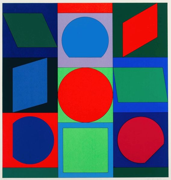
Copyright: Frederick Hammersley,Fair Use
Frederick Hammersley made "Opposing #15" with oil on board, and right away, you get a sense of his process. It's like he's building this world, piece by piece. The colors are bold, each shape clearly defined, but it's in the surface where things get interesting. Hammersley's paint application is smooth, almost flawless, which feels very deliberate, like he’s trying to hide his tracks. Take that red circle, for example. It’s smack-dab in the middle, but it doesn’t quite sit right, does it? It pushes against the other shapes, creating tension. It reminds me a bit of Mondrian, but with a playful twist. Hammersley invites you to think about how these shapes relate to each other, and what kind of feeling they evoke. Are they opposing, or are they creating a new kind of harmony? It's up to you to decide.
Comments
No comments
Be the first to comment and join the conversation on the ultimate creative platform.
More like this