drawing, graphic-art, pen
#
portrait
#
drawing
#
graphic-art
#
caricature
#
german-expressionism
#
pen
#
modernism
Dimensions: length 14 cm, width 9.5 cm
Copyright: Rijks Museum: Open Domain
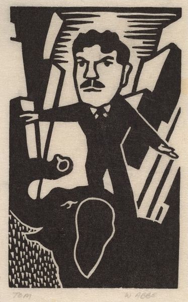
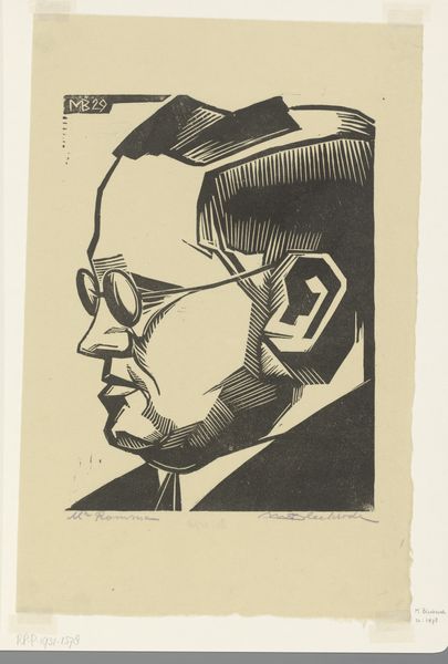
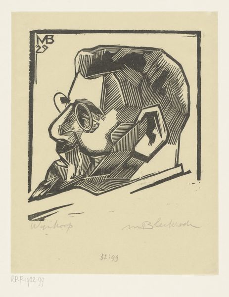
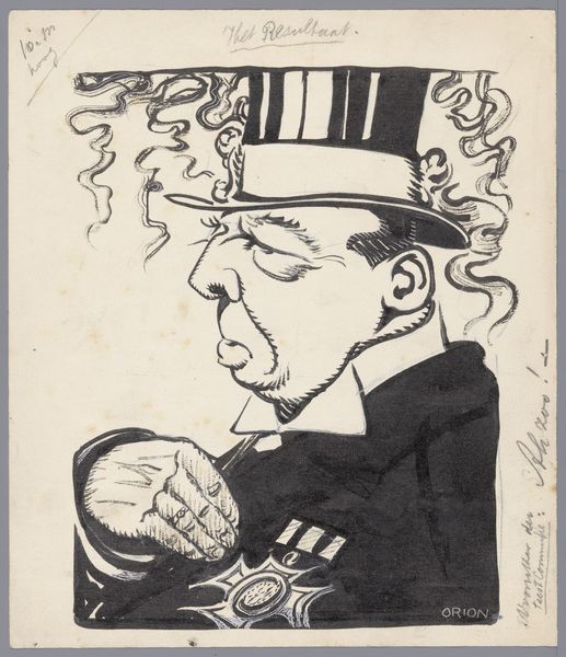
Curator: Before us is “Made in Germany,” a pen and ink drawing, part of graphic art, created around 1918 or 1919. It is currently unattributed, listed simply as by W. den Boer. Editor: The severe angles, the stark contrast… it screams discontent. There’s a bitterness to the rendering of the figure, almost a sardonic twist to the lip. Curator: Note the calculated simplicity of the composition. The limited color palette directs the eye to the caricature's profile, where the stark line work and minimal shading define his features. Editor: I’m struck by that title: “Made in Germany.” Considering its creation in the immediate aftermath of the Great War, the piece drips with sociopolitical commentary. Is it about holding up a mirror? Accusation? Perhaps both? Curator: Precisely! The title and date operate almost as a brand. But one should also be attuned to how the pen's texture informs the symbolic potential of the marks on the flat picture plane. Editor: Interesting choice to utilize the stylistic distortions typical of German Expressionism for what seems almost like… propaganda? It critiques through caricature but does so employing distinctly national art tropes. It seems, well, complicated! Curator: It challenges viewers, compelling them to interrogate not just the image itself, but the cultural narratives and socio-political climates from which it emerges. The choice of medium – the directness of ink – is itself noteworthy. Editor: To create something that is both so raw and so pointed suggests art that attempts to engage head-on with contemporary turmoil. There’s anger in that linework, but there's thought in its presentation. It’s far more potent for that balance. Curator: I appreciate, through your historical interpretation, the levels of commentary and engagement operating beneath the immediate visual reading of the piece. Editor: And I value the formal rigor of identifying exactly how den Boer deploys contrast to deliver this sardonic edge. I’m left wondering what part such artwork played at the time.
Comments
No comments
Be the first to comment and join the conversation on the ultimate creative platform.
More like this