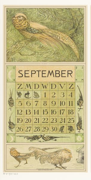
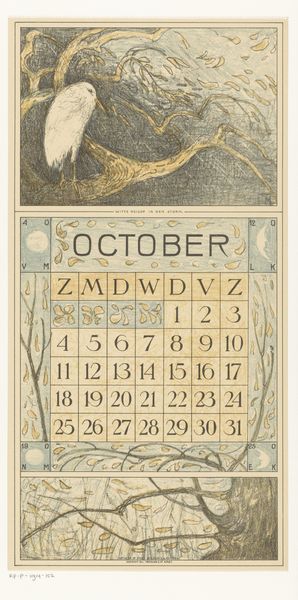
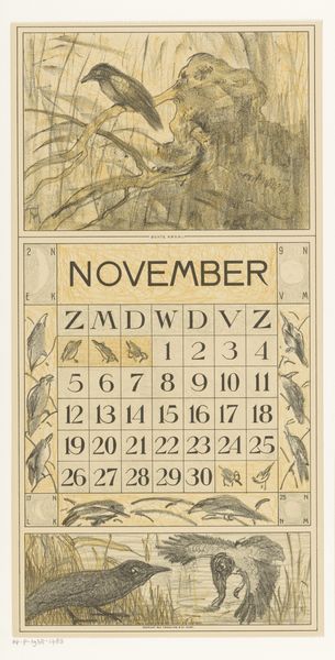
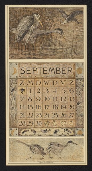
drawing, print, pencil
#
drawing
#
art-nouveau
#
pen drawing
# print
#
pen illustration
#
landscape
#
bird
#
figuration
#
pencil
#
line
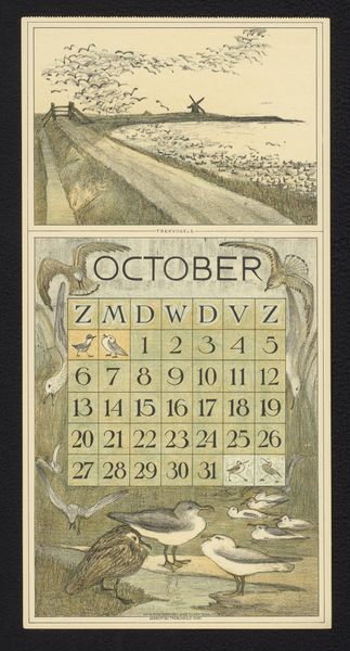
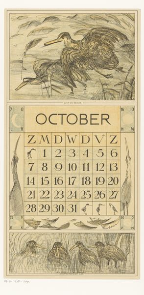
Dimensions: height 420 mm, width 210 mm
Copyright: Rijks Museum: Open Domain
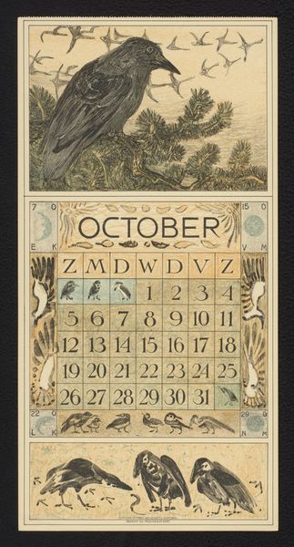
Editor: Here we have Theo van Hoytema’s "Kalenderblad oktober met trekvogels," created in 1917. It’s a drawing and print, seemingly in pencil and ink. I’m immediately struck by the dynamic composition; the birds in flight really capture a sense of movement and freedom despite the limited palette. How would you interpret the structure of this piece? Curator: The piece utilizes a tripartite division, each section offering a distinct perspective. Consider the topmost register, filled with layered hatching indicating depth in the landscape that supports the dynamic sweep of birds rendered in the negative space between reeds. We can follow how this tonal element descends, punctuated by the calendar itself, to reach a conclusion in the watery reflections in the bottom register. Editor: So the tonal relationships are quite deliberate in leading the eye? The framing devices also stand out - the decorative, almost incidental, images of single birds are presented with very high contrast in comparison with those that soar between registers, offering very clear orientation points, almost like visual parenthesis? Curator: Precisely. The stark framing elements serve to compress the overall atmospheric depth, flattening the tonal arrangement to reinforce its nature as a constructed image, which directs attention to the composition’s careful linear articulation. Note the structural counterpoint in each section between defined foreground objects with their complex lines and the open treatment of depth beyond them - can you see how the image is designed to encourage movement? Editor: Now that you mention it, it’s much clearer how that visual structure enhances the implied migration. It seems that by reducing the number of strokes for the birds near the vanishing points, van Hoytema also simulates receding figures, as if speed were the key element to notice above all else. Thank you! Curator: Indeed. By studying its composition closely, the image reveals how surface and depth create and then underscore content in ways one might have otherwise missed, while appreciating only its figurative subject. A useful reminder for my own research as well.
Comments
No comments
Be the first to comment and join the conversation on the ultimate creative platform.
More like this