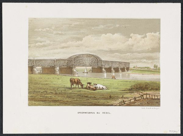
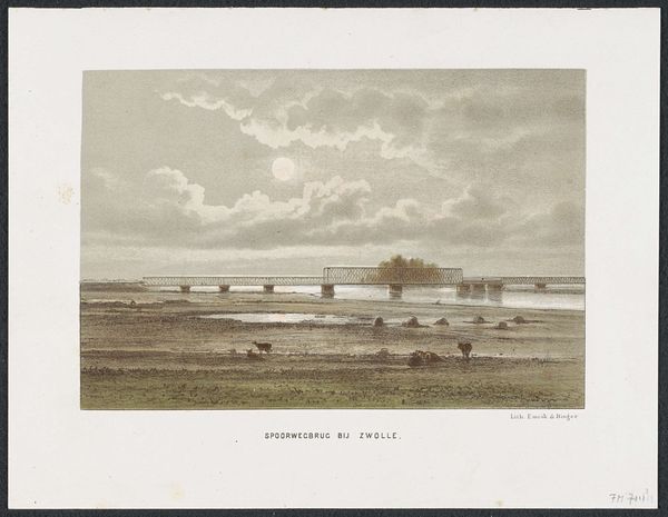
print, etching
# print
#
etching
#
landscape
#
genre-painting
#
realism
Dimensions: height 215 mm, width 292 mm
Copyright: Rijks Museum: Open Domain
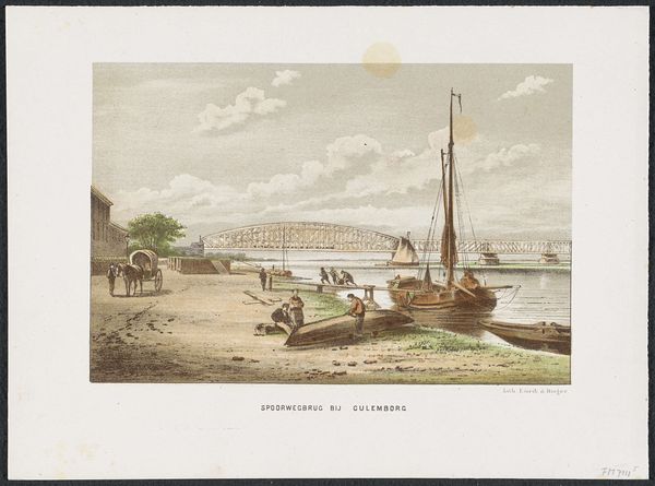
Curator: Look at this— "Waalbrug bij Zaltbommel, 1869," or Waal Bridge at Zaltbommel from 1872-1874. This print is an etching and showcases a beautiful landscape by an anonymous artist. It’s currently held here at the Rijksmuseum. What's your initial reaction? Editor: Serene. I mean, it’s clearly representational, a rather direct depiction. The muted tones, the way the bridge bisects the horizon, it all creates a very calming effect. It reminds me of quiet afternoons spent by the riverbank as a child. Curator: I agree completely, and I feel that speaks to the strength of its realism and its genre-painting touches. I love how the artist included those resting cows. They look so peaceful. It gives a little slice-of-life intimacy that offsets the scale of the industrial bridge and emphasizes the gentle, everyday rhythms alongside technological progress. Editor: Interesting, I'm also drawn to that bridge itself. The way it's meticulously rendered really commands attention. Notice the structure and the light that plays on it, too. It contrasts rather dramatically with the pastoral foreground; I read that opposition as a clever formal device. It highlights a moment of change within the dutch landscape as modernization begins to creep into its idyllic sceneries. Curator: That interplay between the man-made and the natural is pretty compelling. There's an interesting tension; perhaps a gentle melancholy even—or at least a recognition of transition. It almost feels prophetic with a gentle nod towards industry. Editor: I do wonder about the choice to use an etching, versus painting, for example. What do you think? The precision and delicate line work almost mirrors the engineered structure, but it's a softer, more nostalgic touch compared to, say, a sharp photographic approach. The texture in the sky is beautifully achieved! Curator: That's a good point, you know. Etching brings a softness—a bit of timelessness even—that smooths the jolt between pastoral life and modernity that the artist portrays. Thank you for pointing this out! I hadn't thought of it in quite that way. Editor: Well, it's a compelling composition to discuss. The contrast really enhances the nuances and creates a beautiful landscape.
Comments
No comments
Be the first to comment and join the conversation on the ultimate creative platform.
More like this