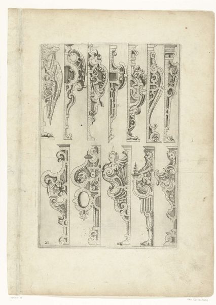
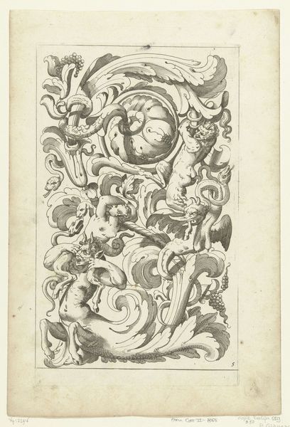
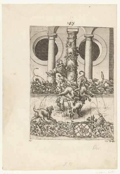
engraving
#
baroque
#
pen sketch
#
form
#
line
#
history-painting
#
decorative-art
#
engraving
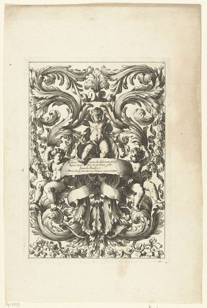
Dimensions: height 212 mm, width 144 mm
Copyright: Rijks Museum: Open Domain
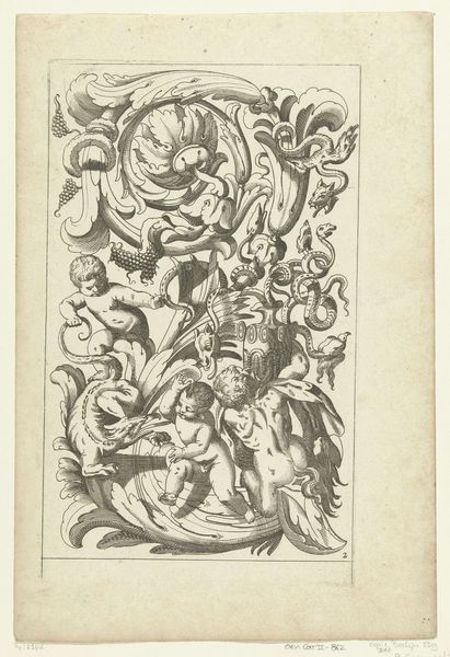
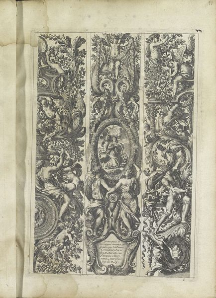
Curator: This pen and ink drawing titled "Drie hoeken van lijsten," roughly translated as "Three corners of frames," created around 1655 to 1657 by Jean Lepautre, immediately strikes me with its Baroque intensity. Look at the incredible detail packed into this small space. Editor: Yes, a powerful ornamental design! I am drawn to how the Baroque style translates in an engraving. The use of black and white emphasizes the texture of each leaf and the play of light across these frame fragments, especially noting how its widespread popularity coincides with shifts in social power. Curator: Precisely. Observe the careful rendering of the acanthus leaves, the plump figures of the putti, and the rather majestic eagle. These elements, while decorative, each contribute to the overall sense of opulent power communicated through classical allusion. Editor: Consider then that Lepautre’s engraving becomes an accessible pattern. We should also see the context within the rise of printed materials and their dissemination. Such engravings offered architects, furniture makers, and other artisans ways to adopt fashionable styles, leveling access across the burgeoning middle class. Curator: Fascinating, the print serves as a democratizing force disseminating styles formerly reserved for the aristocracy. Beyond that socio-historical dimension, it’s the skillful draftsmanship that captivates. Notice the strategic use of hatching and cross-hatching to create depth and shadow; Lepautre masters the language of engraving. Editor: True, that skillful handling of line and tone definitely elevates it, but I find it impossible to divorce Lepautre’s virtuosity from the context of 17th-century French politics and the aspirations of a society under Louis XIV. What at first might appear to be purely decorative design holds the seeds of broader social transformations and aesthetic changes. Curator: Perhaps its real strength is that we can see both: its beauty in pure, formal terms, and its resonance in its time. Editor: I concur! It bridges the gap between art as autonomous form and art as historical document. A vital conversation starter, in either case.
Comments
No comments
Be the first to comment and join the conversation on the ultimate creative platform.
More like this