print, metal, relief, engraving
#
baroque
#
dutch-golden-age
# print
#
metal
#
relief
#
history-painting
#
engraving
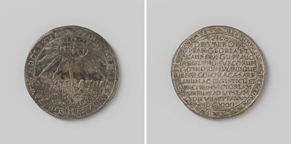
Dimensions: diameter 5.2 cm, weight 40.26 gr
Copyright: Rijks Museum: Open Domain
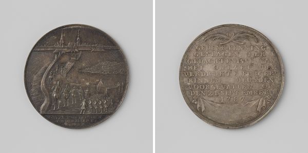
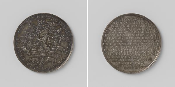
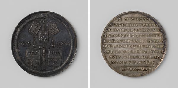
Editor: This piece is a metal engraving titled "Slag op het Slaak," created by Johannes Looff in 1631. It feels weighty, historical – almost like holding a moment in time, or a story, within its circular form. What catches your eye when you look at it? Curator: Immediately, I am struck by the composition itself. Notice how the engraving is divided into two distinct halves, each utilizing a unique textural language. On the one side, we observe figurative relief, perhaps a scene of conflict, rendered with considerable intricacy. On the opposite face, a dense field of inscription takes precedence. It begs the question: how do these two modes of representation interact? Do you perceive a tension, or perhaps a harmony, between the figurative and the textual elements? Editor: I hadn't thought of it that way, but now I see it. There’s a definite contrast. The figural side seems to depict action, chaos even, whereas the text is static, controlled. Almost like a record of the event. Curator: Precisely. Consider also the line work itself. Note the fineness of the engraved lines, and the manner in which they create both form and texture. Are there areas where the line seems more expressive, more dynamic? Editor: I think so. The area with figures battling has bolder, more frantic lines, suggesting movement, whereas the text is more uniform and still. Curator: Indeed. And this careful control of line contributes to the overall balance and impact of the work, prompting a deeper consideration of its structural elements. Did this help you better understand this object? Editor: Yes, definitely! Thinking about the contrast between the active image and the controlled text makes it seem much more dynamic than when I first looked at it. Thank you.
Comments
No comments
Be the first to comment and join the conversation on the ultimate creative platform.
More like this