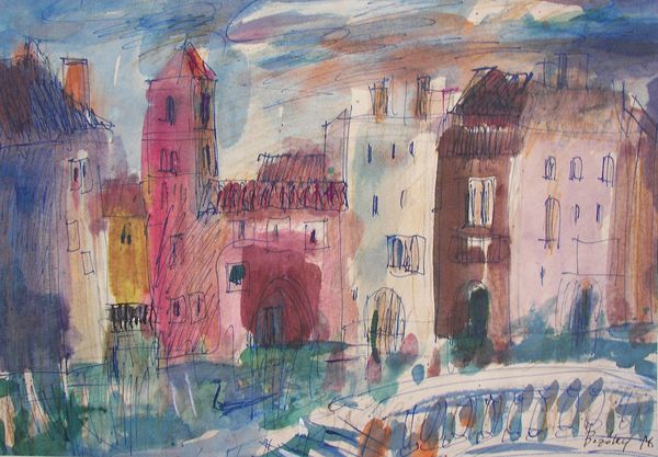
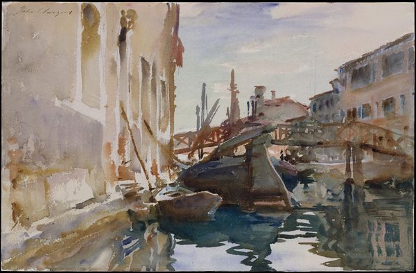
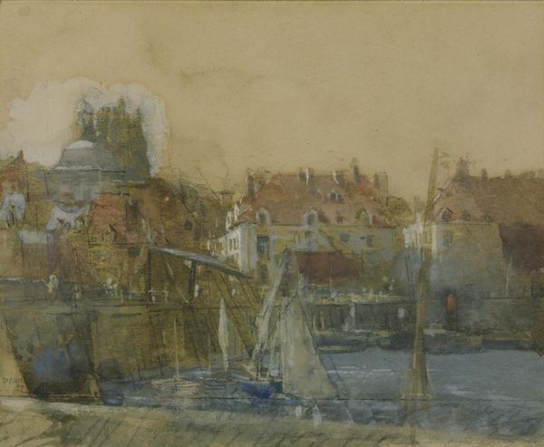
plein-air, watercolor
#
impressionism
#
impressionist painting style
#
plein-air
#
landscape
#
oil painting
#
watercolor
#
cityscape
#
watercolor
Copyright: Public Domain: Artvee
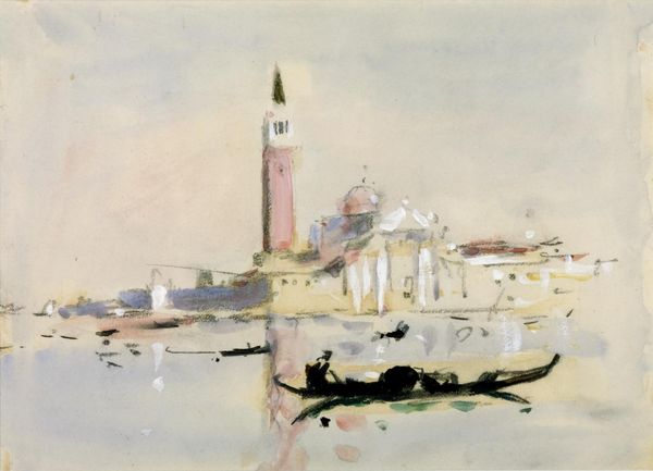
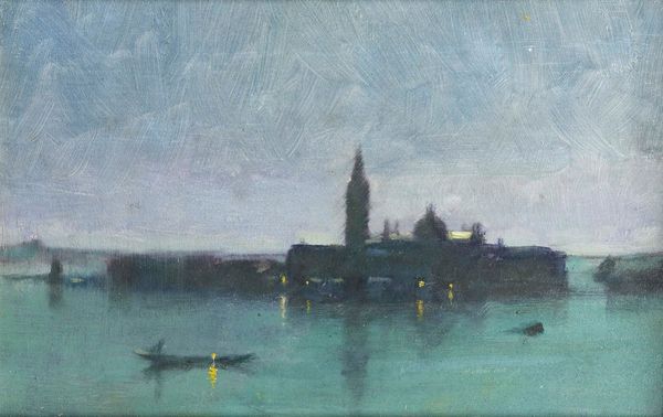
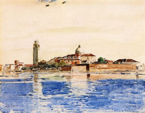
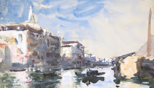
Curator: Here we have Hercules Brabazon Brabazon’s watercolor, "San Giorgio Maggiore, Venice," likely created between 1840 and 1906. Editor: Immediately, I notice the ephemeral quality, that capturing of a fleeting moment, almost as if rendered in a dream. The strokes, loose and free, seem to breathe. Curator: Indeed, it's a fine example of impressionistic principles. Note the compositional balance: the campanile anchoring the scene, juxtaposed with the receding planes of buildings and water. How do you see Brabazon manipulating the material qualities of watercolor here? Editor: I’m struck by the deliberate application. Brabazon exploits the fluidity of the medium, letting washes pool and mingle, which creates these subtle tonal gradations. This gives it the atmospheric depth; he understood how the behavior of water on paper could replicate Venice's characteristic light and moisture. I bet he painted it *en plein air*, confronting material contingencies in real time. Curator: I would agree that is probably an open-air work. Look at how color is divorced from strict representational accuracy. Pink hues dance across surfaces that we know to be stone or brick, creating an emotional, rather than factual, rendering of the city. What meanings or social values are constructed and mediated through these choices of rendering? Editor: For me, this looseness speaks to a democratized, subjective experience. Brabazon breaks from the rigid conventions of academic landscape painting, privileging the artist's personal sensory experience. Instead of an accurate record of buildings, the built environment acts like the backdrop to personal sensation. I feel its lack of detail refuses labor, especially that of earlier topographic artists. He values the act of free creation and expression more. Curator: The structural implications are considerable, even beyond a democratized vision. Consider, for example, that the lack of clear form pushes the viewer towards a pure aesthetic encounter. We must surrender to the sensory experience rather than focusing on detail or any symbolic readings we might try to draw out. The floating forms mirror that experience: it exists for itself and is complete only in relation to its color and composition. Editor: That pure aesthetic certainly relies upon material intelligence; this isn’t thoughtless, quite the contrary! Each gesture, each dripping stroke is made through learned, embodied knowledge. It showcases an impressive technical fluency with the contingencies of painting with watercolor. Curator: Very well put. The piece creates an image that mirrors this artist's commitment to structure through light, color and composition, revealing how formal properties invite unique sensorial experience. Editor: Absolutely. It urges us to notice the real conditions of art making. And the final piece? Well, the final piece offers a lovely, subtle meditation on labor and how value can be found through both process and chance.
Comments
No comments
Be the first to comment and join the conversation on the ultimate creative platform.
More like this