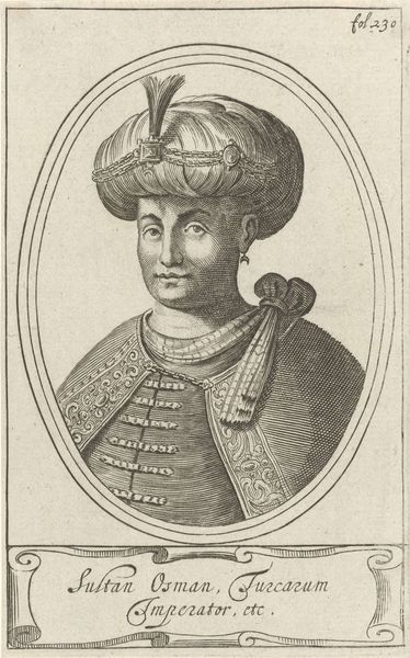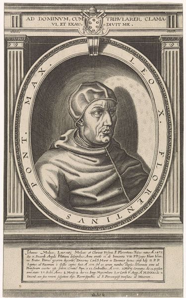
print, engraving
#
portrait
#
baroque
# print
#
engraving
Dimensions: height 175 mm, width 118 mm
Copyright: Rijks Museum: Open Domain
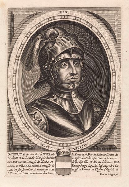
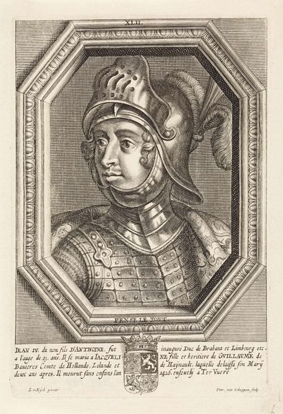
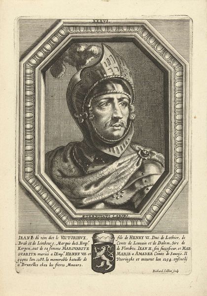
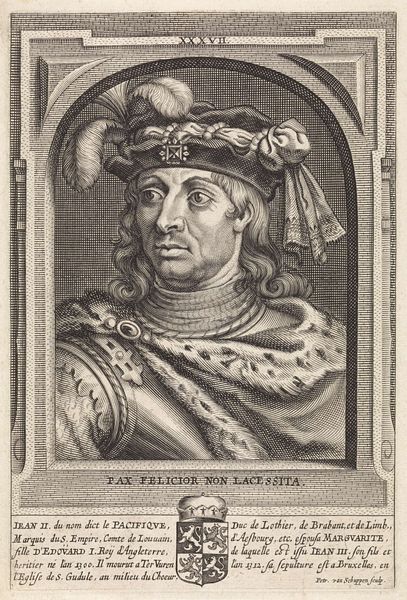
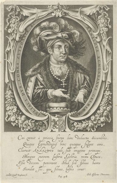
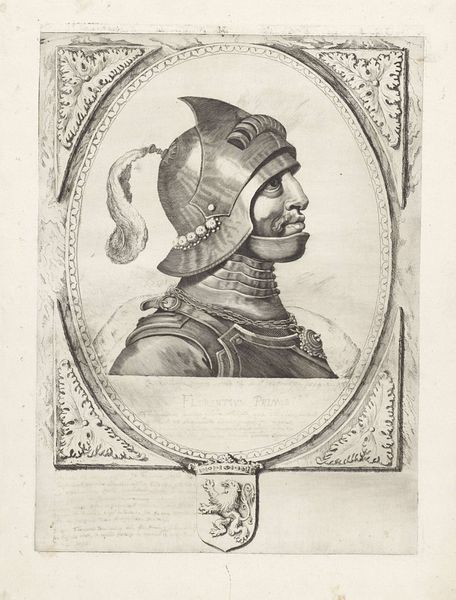
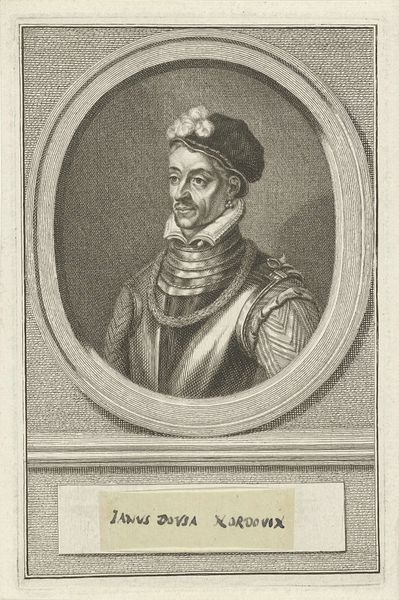
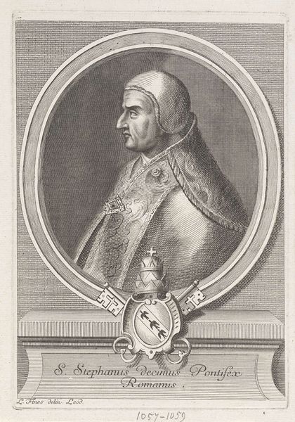
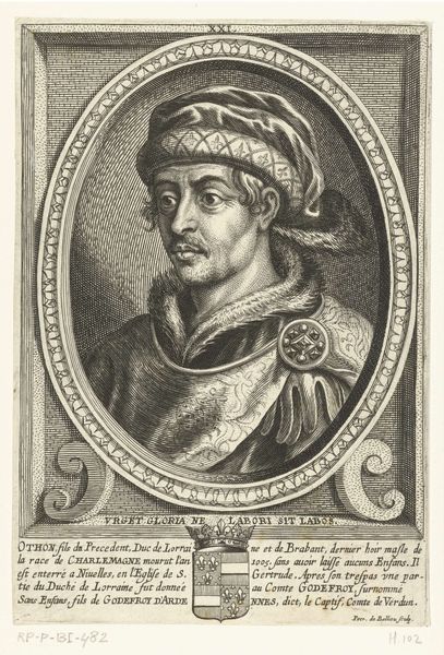
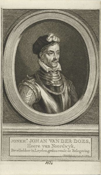
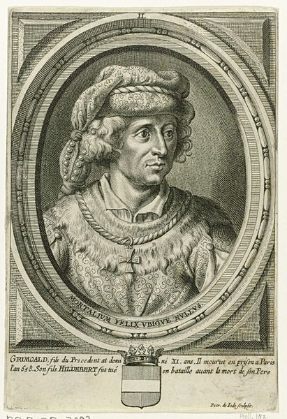
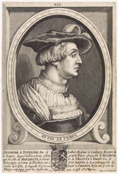
Editor: So, here we have "Portret van Karel Martel," a portrait of Charles Martel, from the 1660s by Pieter van Schuppen. It's an engraving, which is fascinating. He looks... well, stoic. Imposing, even in this small, detailed print. What strikes you when you look at this piece? Curator: Oh, there's a world to unpack here, isn't there? My initial impulse? To tell you that sometimes historical accuracy takes a backseat to artistic... flourish! That helmet, for instance, speaks volumes – or perhaps whispers loudly! It’s more theatrical than practical. Look closely, and it seems almost whimsical with that crest of feathers. Pieter is not only portraying Charles Martel; he is curating a legend around him. Does this align to what extent the so called Hammer truly acted for those values inscribed here? Editor: I see what you mean. It’s definitely more showy than what you'd expect for functional armour. Do you think that was common in portraiture back then – idealizing the subject? Curator: Absolutely! Think of Baroque portraiture as the Instagram filter of the 17th century. Van Schuppen is subtly amplifying Charles Martel's heroic image. This wasn’t simply about capturing a likeness. It was about projecting power and legitimacy. The flowing lines, the ornate frame... everything contributes to that effect. Tell me, how does the inclusion of the text affect your impression? Editor: Hmm... I hadn't thought much about the text... mostly because it's hard for me to read. Curator: Indeed. However, placing it alongside Charles' portrait invites one to not simply *see* him, but *read* him, and invites another angle on Martel's self-fashioned identity. But one could also ask what all this detail obscures from the picture as a whole. Editor: That’s a really interesting point – the reading versus seeing aspect. So much of how we understand figures from history comes from curated portrayals like this. Curator: Exactly! It is exciting how so many tiny lines become these portraits. Editor: Yeah! Well, I have to say, I hadn't considered the sort of… promotional aspect of it, or the way text frames visual information. This print tells so many stories.
Comments
No comments
Be the first to comment and join the conversation on the ultimate creative platform.
