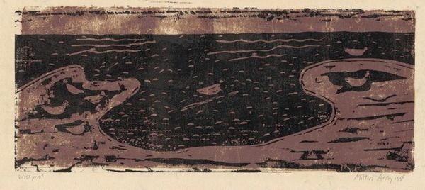
drawing, print, ink
#
drawing
# print
#
landscape
#
ink line art
#
ink
#
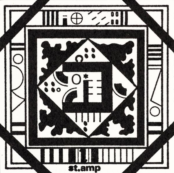
geometric
#
line
#
symbolism
#
cityscape
Copyright: Public domain
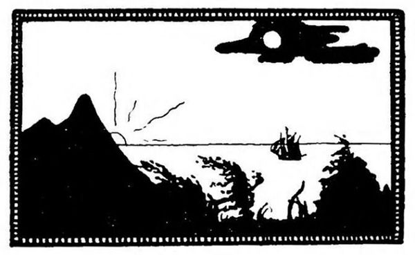
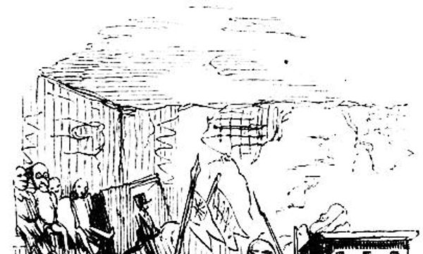
Harry Clarke created this illustration called 'The Year's at the Spring', and it's just black and white, which already sets up a certain mood, right? The solid black ink is laid down with such precision, describing the detailed rigging of the ship. Look at that little moon. It’s a stark contrast to the dense darkness below, almost like a tiny peephole into another dimension. The texture! You can practically feel the roughness of the sea just from the way Clarke renders it. This reminds me a bit of Aubrey Beardsley, with that same dedication to sharp lines and stark contrasts. But Clarke brings a certain moodiness, a hint of the gothic. It’s like he’s not just drawing a picture, but casting a spell. These artists aren't just showing us what they see, they're inviting us to feel something. And that's the magic of art, isn't it?
Comments
No comments
Be the first to comment and join the conversation on the ultimate creative platform.
More like this