drawing, print, typography
#
drawing
#
medieval
# print
#
typography
Dimensions: Overall: 7 13/16 x 6 3/16 x 3/8 in. (19.8 x 15.7 x 1 cm)
Copyright: Public Domain
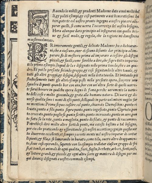
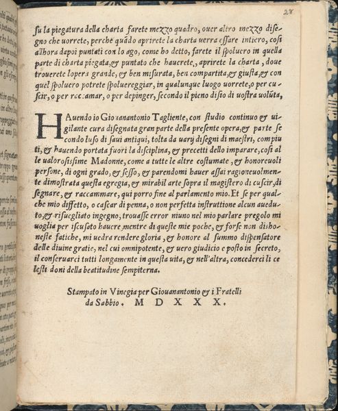
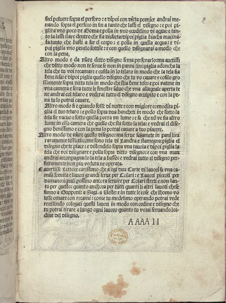
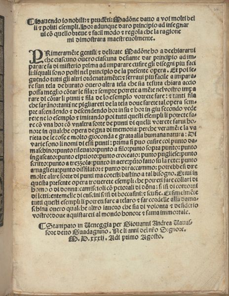
This is page 26 from Giovanni Antonio Tagliente's *Esempio di Recammi*, printed in Venice in 1528, a manual on embroidery patterns. At first glance, the dense columns of blackletter text command our attention. Yet, the carefully designed layout subtly guides the eye. The page is structured around a clear hierarchy. The initial capital letters serve as visual anchors, dividing the text into distinct sections. Note the interplay between the linear text and the decorative border to the left, a pattern of geometric shapes. The use of contrast is stark, with the black ink sharply defined against the off-white paper, giving a sense of depth. The layout emphasizes order and clarity, reflecting the Renaissance desire to codify and disseminate knowledge. Even in a practical manual, the formal arrangement of elements conveys a deeper cultural value: the pursuit of harmony through structure and design. This interplay between form and function reveals a sophisticated understanding of visual communication.
Comments
No comments
Be the first to comment and join the conversation on the ultimate creative platform.
More like this