Gedrukte aankondiging van de prentserie van de Delftse maskerade, 1862 Possibly 1862 - 1863
anonymous
Rijksmuseum
print, typography, poster
dutch-golden-age
typography
poster
Dimensions: height 213 mm, width 135 mm
Copyright: Rijks Museum: Open Domain
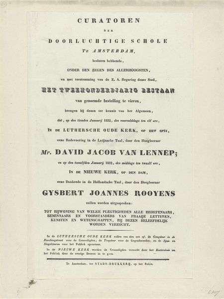
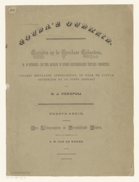
Curator: This lithographic poster, possibly from 1862 or 1863, announces a series of prints commemorating the Delft masquerade. It resides in the Rijksmuseum and is attributed to an anonymous artist. The print details the spectacle and is full of interesting period details, like the listed price of six Guilder. What is your initial impression? Editor: My first thought is, “Wow, that's a LOT of text.” The visual impact relies solely on typography, which feels quite different from today’s poster design with bold colors and graphics. It speaks to a different era of communication, of public spectacle in which information, literally, was layered into events. It gives me a feeling of a considered culture with high literacy. Curator: Exactly. As an iconographer, do you find that typography becomes a visual symbol in itself? The arrangement, the font choices... surely they communicate something beyond just the literal text? Editor: Absolutely! The very deliberate use of different fonts—serifs and sans-serifs mixing—almost feels like different voices speaking at once. There's a formality to the main announcement and then a more descriptive, flowing typeface lower down, offering perhaps a sense of occasion versus detailed information. Even the little flourishes, like the line decorations, add a layer of elegance, signaling an important civic event. Curator: I find it interesting that it references back to 1602 in connection with Prince Maurits of Nassau. You have to wonder about this attempt to root the Dutch identity. In times of societal flux, this could point towards anxiety, perhaps? Editor: I think that's spot on. Referencing a "golden age" – this is all about projecting an image of strength and cultural sophistication in an age of profound and disorienting technological shifts. Notice how it celebrates The Old Dutch Republic? Nostalgia, even invented nostalgia, serves as powerful glue during moments of transition. These symbols offer assurance, promising continuity in a world that suddenly seems unpredictable. And of course a society of artists must hold public displays like this, so artists will get commissioned. Curator: Fascinating, to see how a simple printed announcement reveals so much about the values and anxieties of its time. I’m seeing an argument for tradition in the face of great change here. Editor: Yes. This typography is not just about selling prints, but it’s a mnemonic, designed to awaken collective memory and build morale during uncertain times. Visual symbols matter. They persist and continue to speak volumes across generations.
Comments
No comments
Be the first to comment and join the conversation on the ultimate creative platform.