drawing, ink, pen
#
drawing
#
pen sketch
#
figuration
#
ink
#
pen
Copyright: National Gallery of Art: CC0 1.0
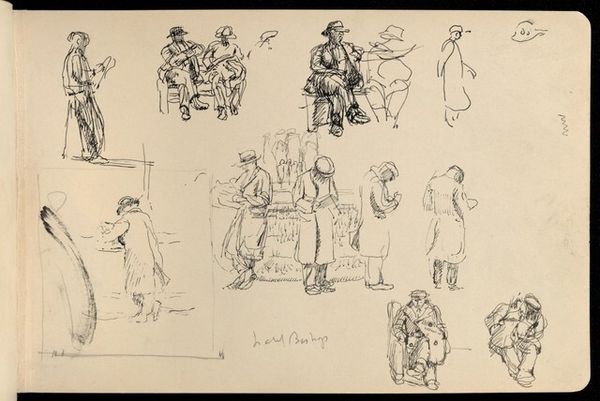
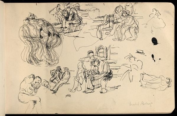
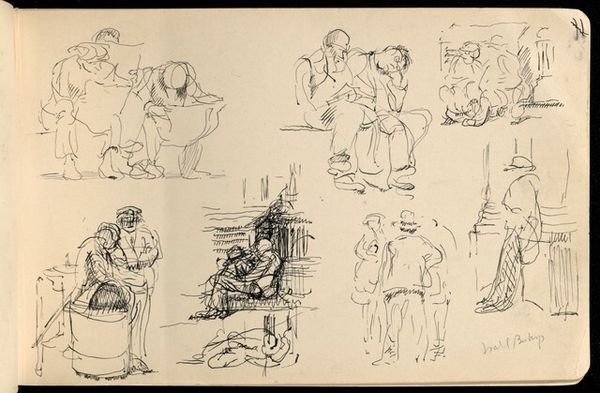
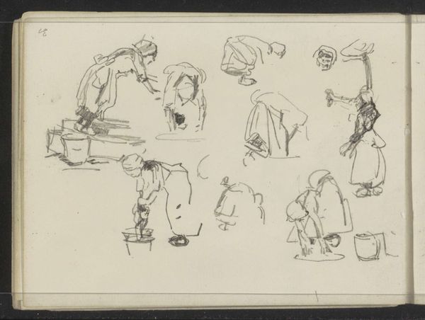
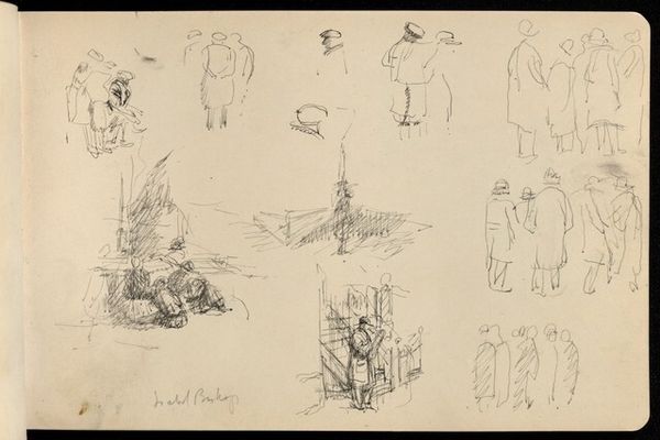
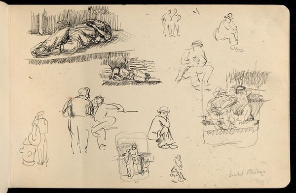
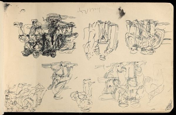
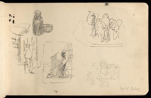
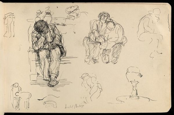
Editor: Here we have Isabel Bishop's "Early Sketchbook," created between 1928 and 1936, using pen and ink. It's quite informal, like a peek into the artist's thought process. There's a restless energy to these quick sketches, a sense of constant observation. What strikes you most about its composition? Curator: The interplay of line and form is indeed compelling. Bishop employs a nervous, almost frenetic, linework, creating a sense of dynamism and movement within a static medium. Notice how the density of lines varies across the page. In areas where figures are more defined, we see a heavier concentration, building up the form and volume. This contrast in line weight guides the eye and establishes a hierarchy within the composition. How does the repetition of similar figures affect your interpretation? Editor: It's like she's exploring the same subject from slightly different angles or at different moments. There is something cubist about that effect. Curator: Precisely. The repetition allows Bishop to dissect the figure, to analyze its essential structure. The eye is forced to compare and contrast, seeking common threads and subtle variations. Semiotically, each repetition could be read as a signifier, adding layers of meaning and challenging the notion of a singular, fixed representation. Consider the negative space – the areas left untouched by ink. How does this contribute to the overall impact of the work? Editor: The white space makes the page feel less crowded and also heightens the immediacy of the drawings. If there was no empty space, you wouldn’t notice the variation in line as much. Curator: Absolutely. It is the deliberate articulation of figure and ground that defines this page, giving air to the various attempts at sketching figures in public spaces. Do you notice any specific areas where the relationship between line and space is particularly effective? Editor: I think in the upper-right corner. You can tell the artist was looking to fill the space, but at the same time leave areas empty in order to call attention to how light reflects differently from skin and material. Curator: I concur, the strategic arrangement generates balance and prevents the page from feeling overly dense, reinforcing Bishop's interest in structure and light as part of the sketching exercise. It is fascinating how a sketchbook page can be studied as a finished drawing. Editor: This close analysis really enriches my appreciation for what goes into even seemingly simple sketches.
Comments
No comments
Be the first to comment and join the conversation on the ultimate creative platform.
