drawing, watercolor, ink
#
drawing
#
baroque
#
ink paper printed
#
caricature
#
watercolor
#
ink
#
folk-art
#
watercolour illustration
#
genre-painting
#
cartoon carciture
Dimensions: height 170 mm, width 110 mm, height 320 mm, width 225 mm
Copyright: Rijks Museum: Open Domain
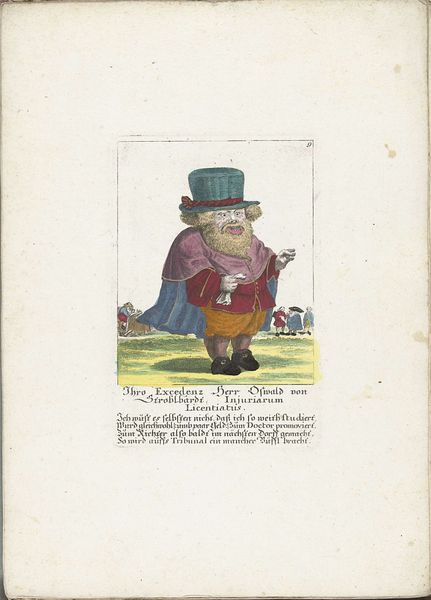
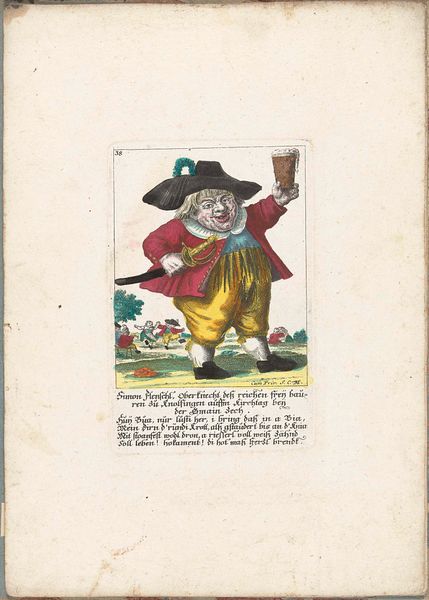
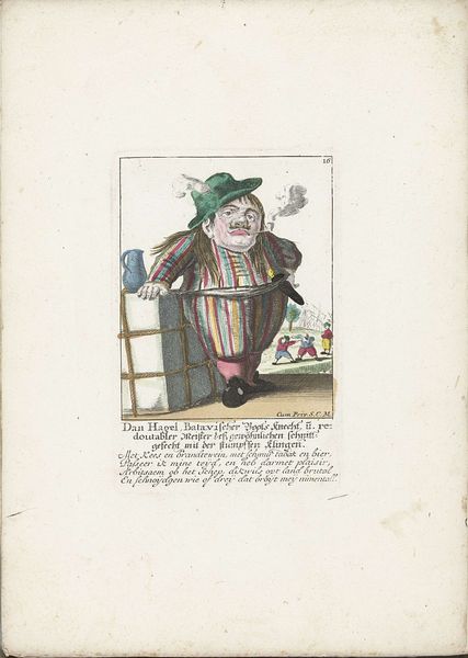
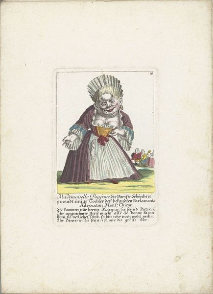
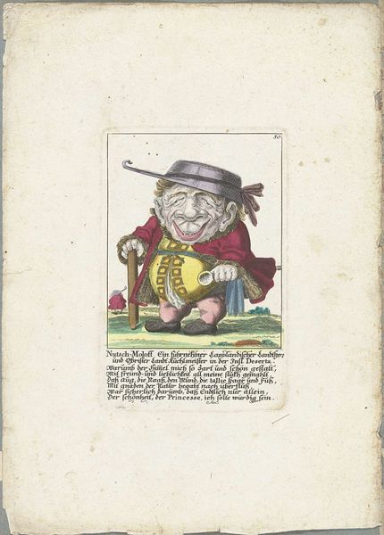
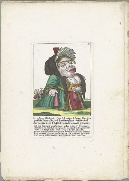
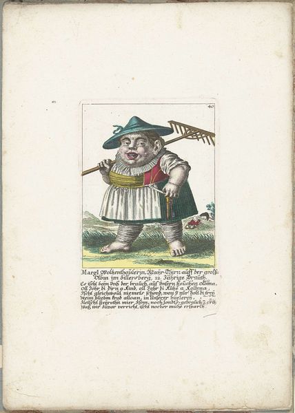
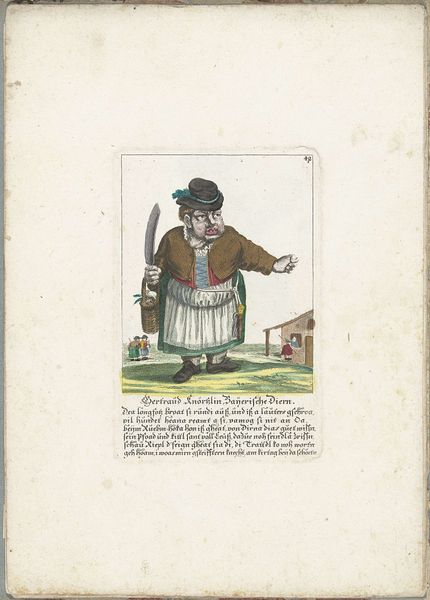
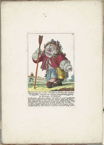
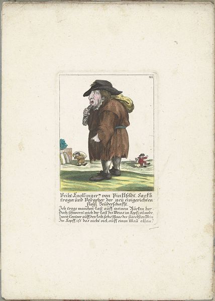
Curator: Let's delve into "De dwerg Ursula Schleglin," a print crafted around 1710 by Martin Engelbrecht. It resides within the esteemed collection of the Rijksmuseum. Editor: It's...striking. The exaggeration of form, the rather grotesque features—there's a powerful element of caricature at play here, but the almost vibrant use of watercolour creates an immediate visual tension. Curator: Indeed. Engelbrecht’s print enters a dialogue about social roles. Ursula Schleglin, labelled as a dwarf, is placed within the landscape of court entertainment. How does this intersect with societal perceptions of people with dwarfism at the time? The inscription hints at a playful mockery of her status. Editor: It also creates tension. Look at the use of line; it's deceptively simple but conveys an immense amount. The layering of watercolour and ink emphasizes specific forms to push proportions. And look at the background colours, subtly suggesting an illusion of depth to isolate the subject. Curator: The fact that this was a printed image points towards broader accessibility. Did the proliferation of prints like this perpetuate existing prejudices? Were there avenues for subversive readings by different audiences? It begs these types of considerations about visual culture’s influence in early modern Europe. Editor: But beyond that, I'm struck by the tactile quality, or what seems tactile in the printed rendering of layered ink and colour, it’s meant to give form a nearly tangible presence within a rigidly defined frame. See how it isolates the main subject, it evokes a sort of uncomfortable intimacy. The framing acts as a stage. Curator: Exactly. The "stage" sets an odd scene—the composition guides our eye from the immediate character to what she means within the culture of the time. Engelbrecht prompts the viewer to confront preconceived notions. And the use of text... Editor: It amplifies the distortion, which brings an added dimension to our interpretation; the artist's work gives visual, textural, even sensational impact. Curator: Ultimately, examining a piece like this involves confronting uncomfortable aspects of the past while considering the enduring power of visual representation. Editor: Indeed, seeing the grotesque exaggeration of form in relation to spatial context really illuminates this historical complexity.
Comments
No comments
Be the first to comment and join the conversation on the ultimate creative platform.
More like this