drawing, paper, ink, pen
#
portrait
#
drawing
#
hand-lettering
#
hand drawn type
#
hand lettering
#
paper
#
personal sketchbook
#
ink
#
hand-drawn typeface
#
ink drawing experimentation
#
pen-ink sketch
#
pen work
#
sketchbook drawing
#
pen
#
sketchbook art
#
calligraphy
Copyright: Rijks Museum: Open Domain
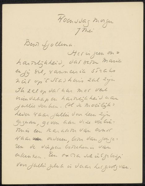
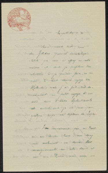
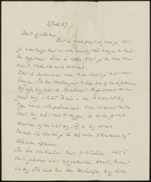
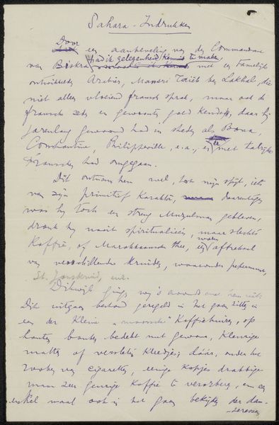
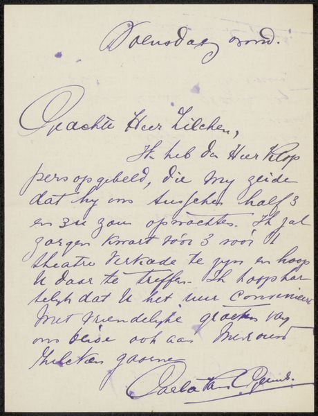
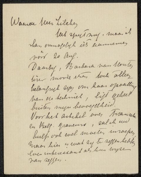
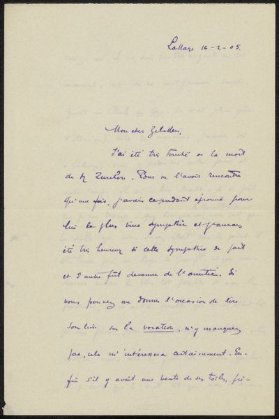
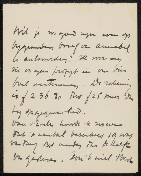
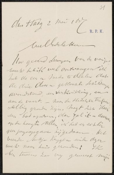
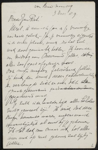
This is a letter, written in 1910 by Hendrikus Hubertus van Kol, likely with a fountain pen and dark ink on paper. Look at the loops and swirls, the generous curves and angles, it's like a little dance! You can almost feel the rhythm of the writer's hand as he moves across the page. The ink is a deep, saturated blue, creating a sharp contrast against the pale paper, making the writing almost leap off the surface. The letter isn't perfectly neat, with words slightly overlapping and lines tilting gently. It gives the impression of spontaneity and directness, like a quick thought captured in ink. See how the ascenders and descenders of the letters create a kind of visual melody, a rhythm that’s both formal and intimate. This makes me think of Cy Twombly’s scrawled, poetic paintings, where writing becomes drawing, and meaning emerges through the gesture itself. It’s a reminder that even the most functional forms of communication can be beautiful and expressive.
Comments
No comments
Be the first to comment and join the conversation on the ultimate creative platform.
More like this