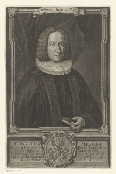
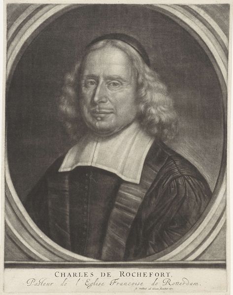
drawing, engraving
portrait
drawing
baroque
engraving
Dimensions: height 275 mm, width 172 mm
Copyright: Rijks Museum: Open Domain
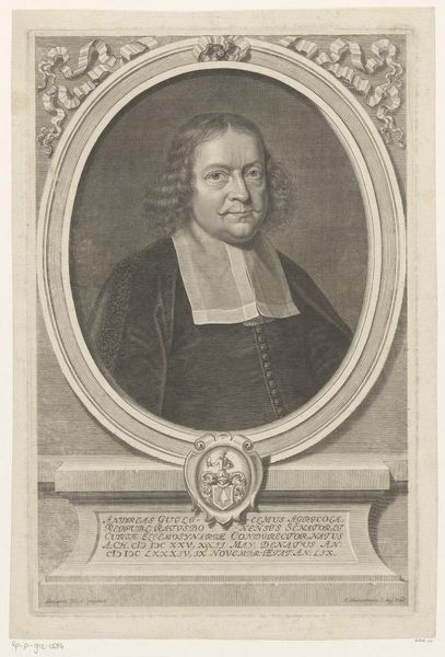
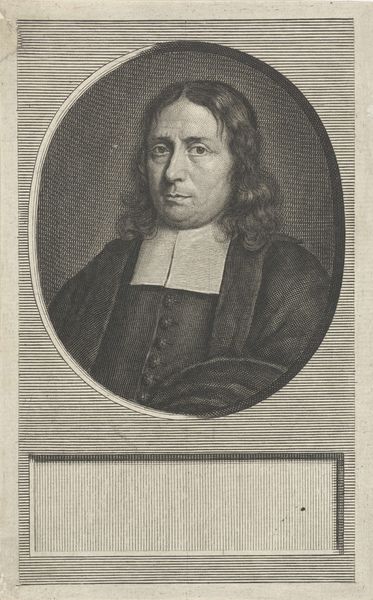
Editor: Here we have a 17th-century engraving titled "Portret van Georg Conrad Bergius." The artist is Heinrich Jakob Otto. It feels quite formal and serious, but I’m drawn to the textures created by the engraving technique. What do you see in this piece that might escape a casual viewing? Curator: Note the careful modulation of light and shadow achieved through the density and direction of the engraved lines. Observe how these lines define the subject’s form, particularly the folds of his garment and the contours of his face. The oval frame containing the portrait, superimposed over a rectangular inscription plaque, provides a dialogue of simple geometric forms. How does the inscription function visually within the overall composition? Editor: I guess the inscription at the bottom provides balance but also anchors the portrait. It feels almost like the man is resting on a pedestal of text. Would you say the geometric frame creates contrast against the more organic lines within the image? Curator: Precisely. Furthermore, reflect upon the quality of the line itself. Consider its thickness, its direction, its density. These variations are not merely descriptive, they are expressive. The formal repetition of the lines and their varied opacities function together. Can we interpret his social rank and the image's intended purpose by decoding it? Editor: That's fascinating! I never thought about line quality being expressive. So much attention to detail for an engraved portrait! It makes you wonder about the artist's intentions. Curator: The act of meticulous creation, demanding control and precision, emphasizes its value as object. Thank you for that careful assessment, considering how various visual components contribute towards interpreting an engraving, has refined our understanding of the artwork.
Comments
No comments
Be the first to comment and join the conversation on the ultimate creative platform.