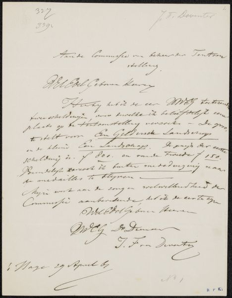
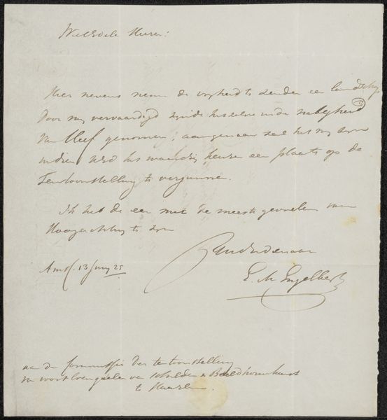
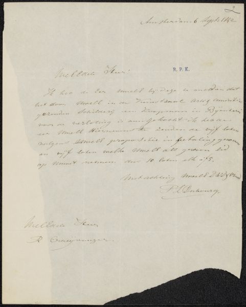
Brief aan de commissie van de Tentoonstelling van Levende Meesters in Utrecht 1848
0:00
0:00
simonvandenberg
Rijksmuseum
drawing, paper, ink, pen
#
drawing
#
ink paper printed
#
hand drawn type
#
paper
#
ink
#
romanticism
#
pen work
#
pen
Copyright: Rijks Museum: Open Domain
Curator: This intriguing piece is entitled "Brief aan de commissie van de Tentoonstelling van Levende Meesters in Utrecht," crafted in 1848 by Simon van den Berg. It is a drawing rendered in ink on paper, now held at the Rijksmuseum. What is your initial impression? Editor: At first glance, the elegant cursive script evokes a sense of formality and tradition, yet also fragility—as if a whisper from the past, laden with societal expectations and the weight of artistic ambition within a highly structured art world. Curator: Indeed, observe how the artist’s choice of materials—pen and ink—and his meticulous penmanship reflect a certain commitment to academic standards. The letter itself becomes a visual record of refined taste and artistic skill. The controlled lines speak volumes. Editor: But beyond the stylistic elegance, consider the context. In 1848, revolutionary fervor was sweeping Europe. Art exhibitions were more than just displays of talent, they were also stages for cultural and political debate. This letter, I suspect, might reveal tensions within that system, negotiations of power, access and maybe even subtle protest against establishment. Curator: Interesting point. The symmetry of the layout—the placement of the date on top right, signature at the bottom—it establishes visual harmony that seems to emphasize the hierarchical protocols of the art world to which the author appeals for consideration. Editor: Perhaps this formality also hides anxieties—an artist seeking validation. The beautifully formed characters cannot hide the precariousness of artistic livelihood depending on selection committee approval. Do you get a sense of how artists had to navigate within restrictive systems to have their voices and vision seen? Curator: I concede the romantic flourish within his style. Still, let us consider it as a study of line, shape and tone independent of socio-historical conditions… The way he used dense strokes to create visual weight against areas where he allows negative space makes you think about legibility and transparency as stylistic choices. Editor: Absolutely. And beyond the purely aesthetic appreciation lies opportunity for further analysis to discuss what these institutions promoted/suppressed given that Romanticism became a crucial conduit for nationalistic sentiment throughout Europe at this critical juncture in art history! This shows why artwork of any kind deserves ongoing critical assessment. Curator: An appropriate way to reassess form meets function in context. Thank you.
Comments
No comments
Be the first to comment and join the conversation on the ultimate creative platform.
More like this