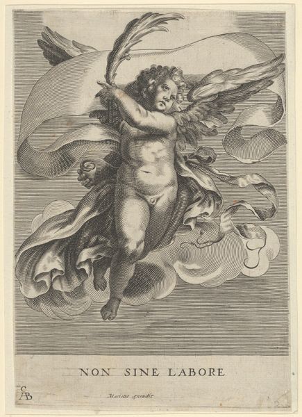
drawing, paper, ink
#
drawing
#
allegory
#
baroque
#
figuration
#
paper
#
ink
#
history-painting
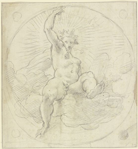
Dimensions: 214 mm (height) x 139 mm (width) (bladmaal)
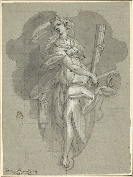
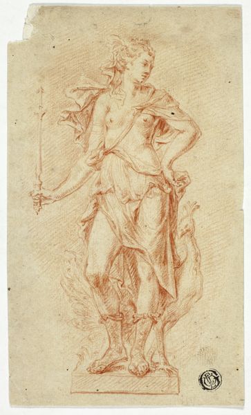
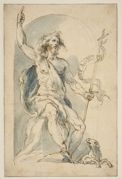
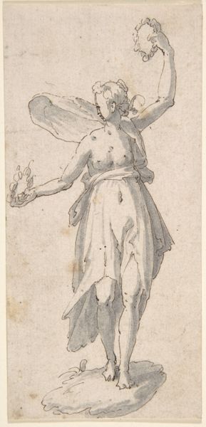
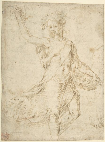
Editor: This ink drawing, called "Mercurius", was created between 1588 and 1631 by Jan Boeckhorst. It depicts the figure of Mercury. The lines are fluid and energetic, but the figure is rather monochrome. How do you interpret this work from a formal perspective? Curator: Precisely. Attending to its formal properties, we observe first the dominance of line over colour. The ink is deployed with varied thickness, creating a sense of depth despite the limited tonal range. The composition revolves around a dynamic contrapposto pose, animating the figure and conveying a sense of imminent movement. Note how the lines, although rapidly drawn, delineate the musculature, lending the figure a sculptural quality. Editor: So, the energy comes from the contrast between defined and sketched lines? Curator: Precisely. Note, also, the integration of light and shadow, not to model form naturalistically, but rather to emphasise compositional structure. Observe how the artist deployed hatching techniques in areas such as the drapery in ways that contribute to a visual rhythm throughout the whole image. The visual effect leads the eye around the artwork to take in the gesture and symbolic elements like the winged helmet. Do you see how the integration of symbolic form with composition creates meaning? Editor: Yes, the formal qualities seem really integral to how we read this allegory. I hadn’t considered it so specifically before. Thank you. Curator: Indeed. It is through careful orchestration of form that Boeckhorst communicates not merely narrative content, but symbolic weight. Considering the Baroque love for allegory, and their innovative explorations of figuration, this integration should hardly surprise.
Comments
No comments
Be the first to comment and join the conversation on the ultimate creative platform.
More like this