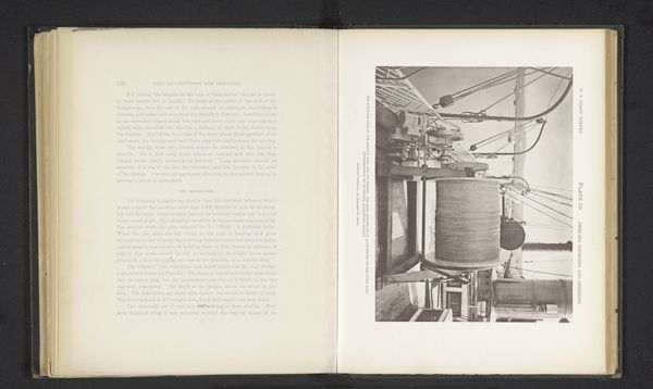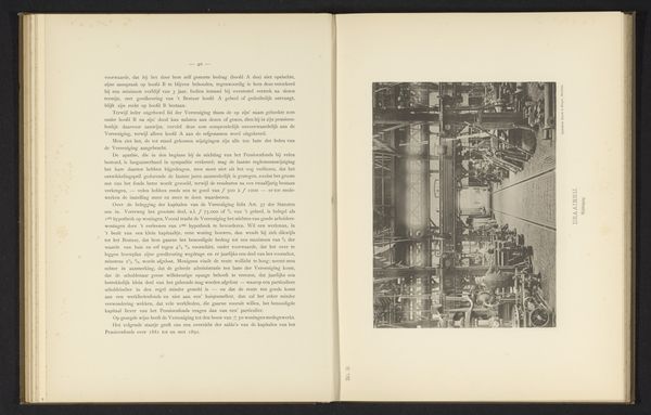
before 1899
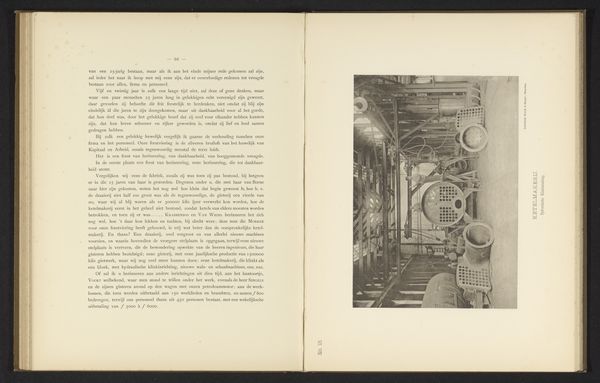
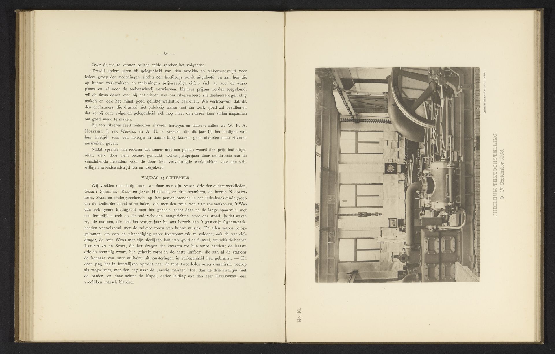
Jubileumtentoonstelling met een stoomketel voor het 25-jarig bestaan van de machinefabriek van Gebroeders Stork & Co
Anonymous
@anonymousLocation
RijksmuseumListen to curator's interpretation
Curatorial notes
Curator: My initial reaction is one of scale; the photograph feels immense and imposing. Editor: That's interesting. This page comes from an album commemorating the 25th anniversary of the Gebroeders Stork & Co machine factory, likely predating 1899. The image captures a steam boiler exhibited at their jubilee. Curator: It's not just the size of the boiler itself, but the density of the mechanical elements. Pipes, valves, and that great wheel, all layered upon each other, create a real sense of power, of potential energy barely contained. It is very industrious and impressive. Editor: Absolutely. Consider the socio-political context: late 19th-century Europe, undergoing massive industrialization. These machines symbolized progress, technological advancement, and the burgeoning power of the working class, while also signifying exploitation and alienation. Curator: Yes, I can see that. But even divorcing the image from its context, the composition holds a certain fascination. The artist directs our gaze with leading lines that draw us into this tangle of machinery, creating an almost overwhelming sensory experience. Editor: This is where I see it differently. I'm particularly struck by how the photographic technology—or rather, its limitations—shapes our understanding. The depth of field compresses the space, flattening the scene and emphasizing the intricate web of interconnected parts. How did the artist make a piece that gives the sensation of standing within that physical space? Curator: And consider what that space meant for workers. These weren't aesthetic objects to the workers, they were tools, a part of their lives. But also possibly oppressive devices within the frame of capitalist exploitation. Editor: The album's design even makes a statement with the opposing page showing a handwritten typeface from a personal sketchbook; what a sharp contrast to the industrialized contents on the opposite page. It encourages one to imagine those designers were very thoughtful when laying out these designs. Curator: Precisely. Examining art as situated within these complicated histories can reveal previously unseen layers of meaning. Editor: Agreed. Ultimately, this piece is a rich testament to a pivotal time in human history. I do wish we had more information about its creator.