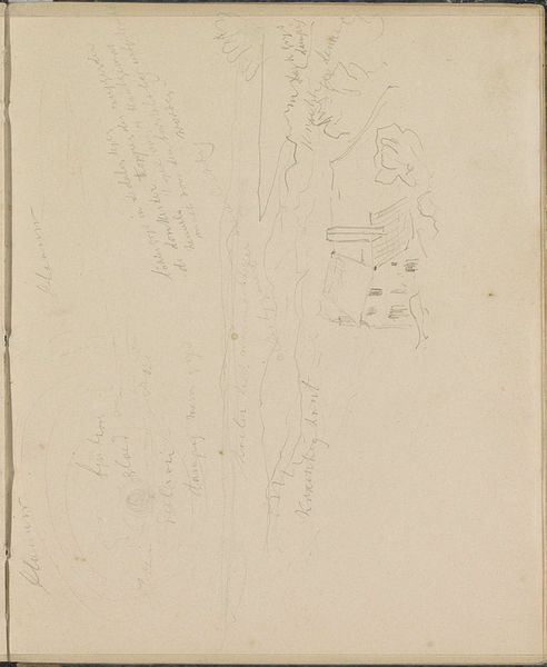
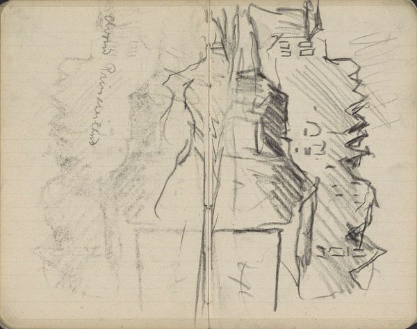
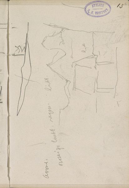
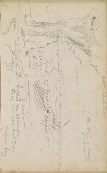
Dorpsweg in Westerlo met uitzicht op de toren van de Sint Lambertuskerk 1841
0:00
0:00
johannestavenraat
Rijksmuseum
drawing, paper, pencil
#
drawing
#
toned paper
#
light pencil work
#
pen sketch
#
pencil sketch
#
incomplete sketchy
#
landscape
#
paper
#
personal sketchbook
#
ink drawing experimentation
#
romanticism
#
pen-ink sketch
#
pencil
#
sketchbook drawing
#
sketchbook art
Copyright: Rijks Museum: Open Domain
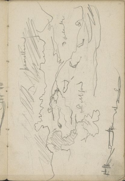
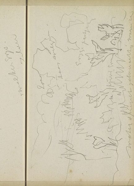
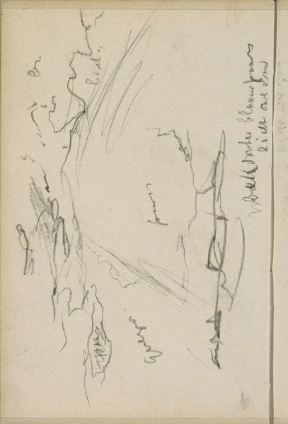
Editor: So, this is Johannes Tavenraat’s "Dorpsweg in Westerlo met uitzicht op de toren van de Sint Lambertuskerk," a drawing from 1841, rendered in pencil on paper. It feels very immediate and sort of unfinished – like a glimpse into the artist's process. What stands out to you about its visual construction? Curator: Immediately, I’m drawn to the line work. Observe how Tavenraat utilizes hatching and cross-hatching, not so much to model form realistically, but rather to establish a sense of depth and spatial recession. The variations in line weight denote a clear foreground, middle ground and background. Notice the density of lines around the tower of the church and the buildings lining the village road; it's a method for constructing depth. Editor: It's interesting how he focuses some areas and leaves others bare, that adds visual complexity to an otherwise simple subject. Curator: Precisely. And it is the bare toned paper that contributes. It functions almost as a negative space, providing breathing room and emphasizing the precision in the areas where line is applied. We also have to note that the function of line is not to reproduce what the eye sees, but is an arrangement of marks building form that the eye interprets. How the forms interlock is important here: The road seems to intersect the architecture; trees border one side with negative space on the other. Editor: I see. The negative space isolates those structures making them more powerful somehow, pulling the viewer’s eye. Curator: Consider too the orientation of this sketch. While presented on the wall, one is made aware this exists within a sketchbook, opening it as if to interpret personal notations that have been made surrounding the architecture. That the function here is personal to the artist in this private setting is important to understand. Editor: So much to unpack from something that seems so simple at first glance! I guess the artist's choices about composition are essential to meaning. Curator: Indeed, it provides a framework for comprehending not just the subject, but also the underlying mechanics of representation itself. That it presents itself as a fleeting glance, while still maintaining clear lines is compelling in its structure.
Comments
No comments
Be the first to comment and join the conversation on the ultimate creative platform.
More like this