drawing, graphic-art, paper, typography, ink
#
drawing
#
graphic-art
#
art-nouveau
#
script typography
#
hand-lettering
#
bold typography
#
typeface
#
hand drawn type
#
typography
#
hand lettering
#
paper
#
typography
#
ink
#
hand-drawn typeface
#
thick font
#
typography style
#
calligraphy
Dimensions: height 132 mm, width 111 mm
Copyright: Rijks Museum: Open Domain
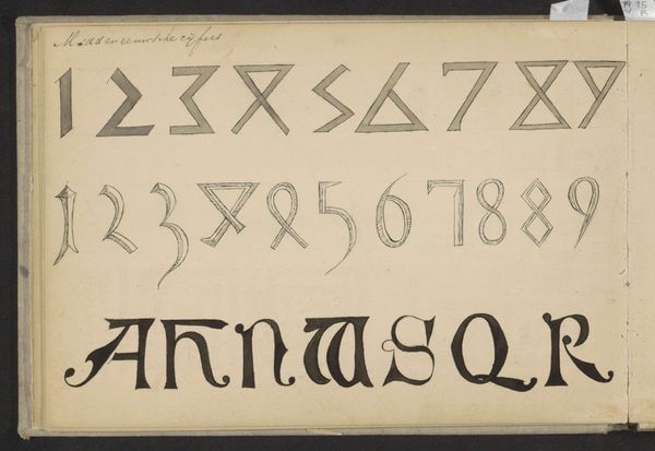
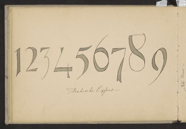
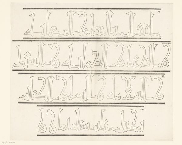
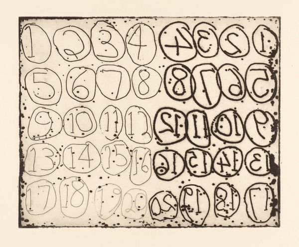
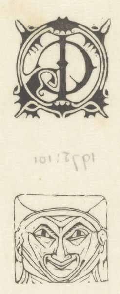
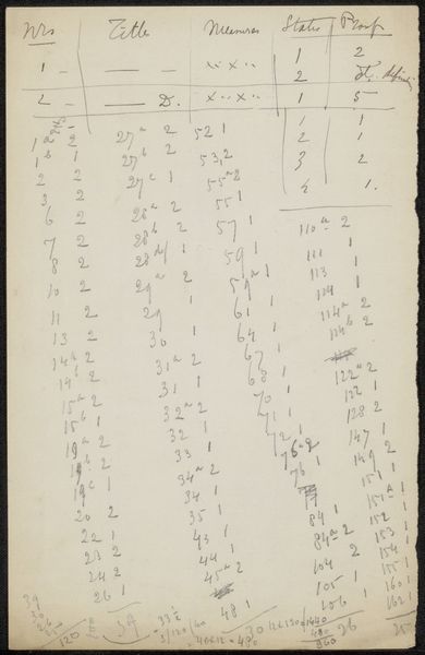
Curator: This whimsical piece, titled "Gekalligrafeerde Cijfers," which translates to 'Calligraphed Numbers', was created in 1920 by Gerrit Willem Dijsselhof. He's rendered these numerals in ink on paper with an undeniable Art Nouveau flair. Editor: Immediately, I'm struck by the playful rhythm! The numbers practically dance across the page, don't they? It's like each digit has its own little personality. Curator: Absolutely! Dijsselhof was deeply immersed in the decorative arts, and this is a prime example. He wasn’t just writing numbers, he was composing a visual symphony. Notice how the thickness of the lines varies, adding a tactile dimension to each character. Editor: It's a rebellion against the rigidity of traditional typography, isn't it? In a world increasingly dominated by mass production and standardization, here's Dijsselhof, insisting on the beauty of the unique, handmade mark. Were these studies for a specific font, perhaps? Curator: It's suspected these drawings might have been sketches and designs for books, perhaps even for children. Remember that in this period, there was an enormous interest in typography as an applied art that can have aesthetic value by itself, a democratic notion in a way, as design can meet any person regardless of the social status. The flowing lines are signature Art Nouveau. But it also brings calligraphy to mind, where each number becomes a delicate expression of line and form. Editor: Seeing these numerals divorced from their functional purpose – calculation, labeling, indexing – forces us to reconsider their aesthetic potential. What do numbers mean, divorced from their role in capital and economy? Are they just forms like any other? It's a subtle critique, perhaps. Curator: It is indeed, and that makes this humble sheet of paper a reminder that even the most mundane things can become art. The way Dijsselhof played with the line weights, creating dark pools of ink against the stark white paper… there's a sense of drama, of depth, which elevates this above mere exercise. Editor: Looking at it now, I find myself considering how Dijsselhof was using traditional means, like ink and paper, but with an ethos rooted in the possibilities of new technology to communicate more freely. There's something inherently modern about that balance, even today. It’s both very contemporary and beautifully of its time. Curator: It’s amazing that Dijsselhof gives the viewer a new pair of glasses with which to reconsider everyday life.
Comments
No comments
Be the first to comment and join the conversation on the ultimate creative platform.
More like this