#
aged paper
#
homemade paper
#
paper non-digital material
#
pale palette
#
pastel soft colours
#
light coloured
#
white palette
#
personal journal design
#
folded paper
#
paper medium
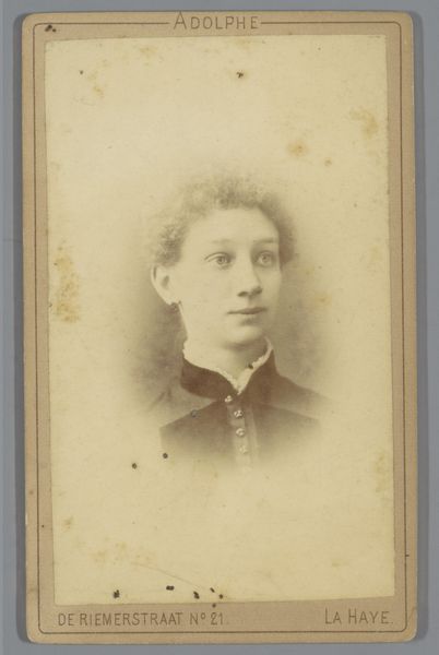
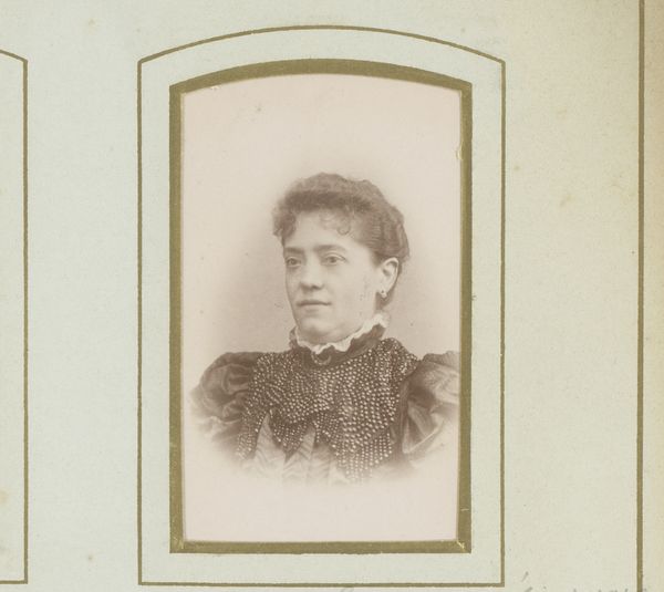
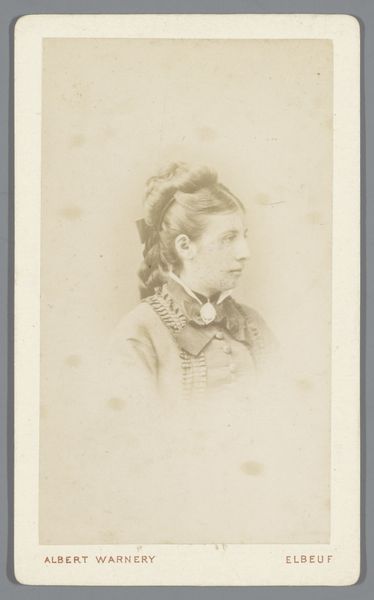
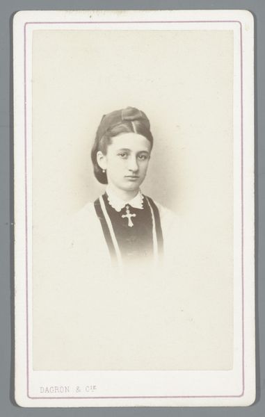
Dimensions: height 103 mm, width 61 mm
Copyright: Rijks Museum: Open Domain
Editor: This is "Portret van Charlotte van Braam" by Albert Delabarre, created sometime between 1880 and 1890, using paper. The monochromatic color gives the portrait a feeling of vintage nostalgia. How do you see this portrait? Curator: Observe how the photograph’s composition is structured around tonal contrast, achieving both clarity and subtle diffusion. Notice the delicate interplay between light and shadow which shapes the sitter's features. The photograph employs a muted palette and its very texture—likely aged—contributes to its visual character. Editor: That's interesting. The light makes her skin look almost porcelain. Is that intentional? Curator: We may consider the formal aspects of this: the smooth, continuous surfaces juxtaposed with the sharper, more defined edges around her face. The lines formed by her clothing direct our focus, too. It is critical to note how light is employed in building dimension while texture suggests materiality. These contribute significantly to its aesthetic. Editor: So it’s more about the play of light and form than necessarily trying to idealize her? Curator: Precisely. By emphasizing formal elements like tone, texture and line over subjective representation, Delabarre is constructing a specific visual experience for the viewer. What’s your takeaway from this now? Editor: I was stuck on the romantic look of it, but I now appreciate how much the composition itself adds to the artwork. Thank you! Curator: A worthwhile point, the structure is important to the whole image, in my view.
Comments
No comments
Be the first to comment and join the conversation on the ultimate creative platform.
More like this