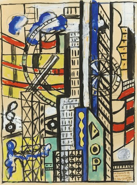
print, acrylic-paint
pop art
acrylic-paint
pop-art
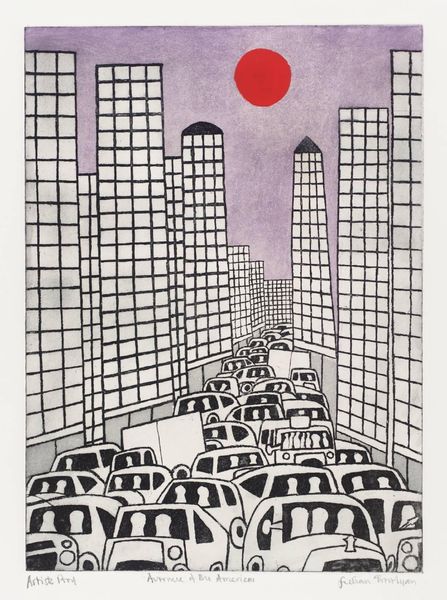
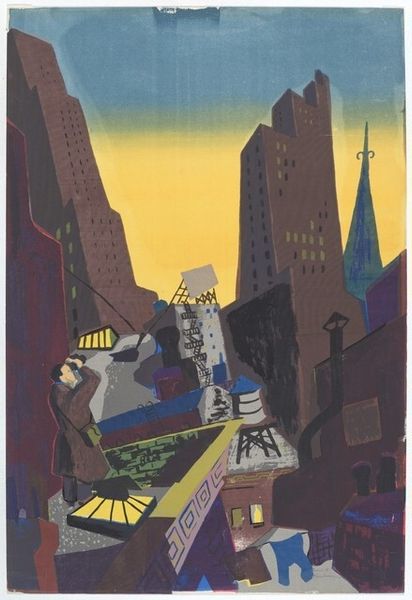
cityscape
modernism
Copyright: Modern Artists: Artvee
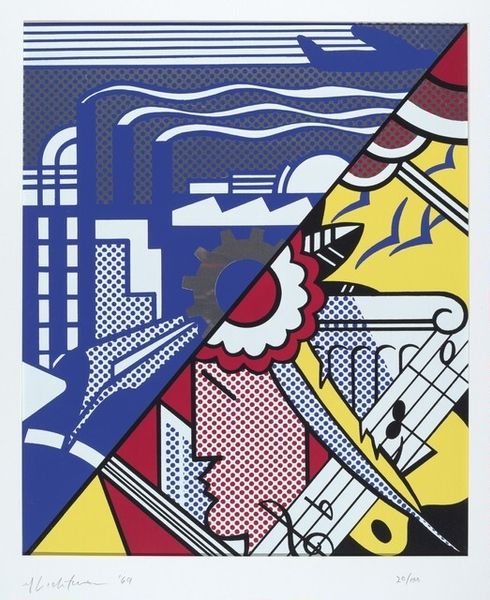
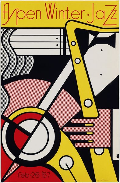
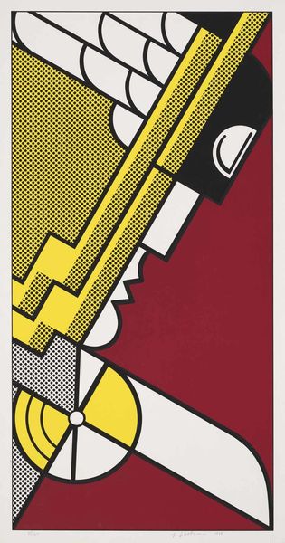
Roy Lichtenstein made this print, sometime in the 20th century, of simplified buildings with bold color and graphic lines. I love the way his art reduces everything to the essentials, like a comic strip version of reality. The flat blocks of yellow and red create a space that feels both familiar and slightly unreal. Look at the dot patterns filling the color fields, that Ben-Day screen, which gives the whole image a kind of manufactured feel, like it's been produced on a printing press, which it has. The black outlines are so crisp and clean, defining each shape with precision, and holding the whole thing together. I love the way it reminds me of art deco posters and the work of Stuart Davis. It's not trying to be realistic, but it does capture something about the feeling of being in a place, a location, maybe somewhere we have dreamed of.
Comments
No comments
Be the first to comment and join the conversation on the ultimate creative platform.