drawing, paper, ink, pen
#
drawing
#
comic strip sketch
#
script typography
#
hand-lettering
#
old engraving style
#
hand drawn type
#
paper
#
ink
#
hand-drawn typeface
#
thick font
#
pen work
#
pen
#
handwritten font
#
columned text
#
calligraphy
Copyright: Rijks Museum: Open Domain
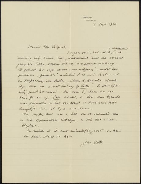
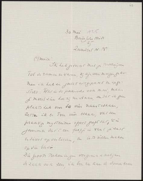
This letter was written by Cornelis Easton in 1925, using ink on paper. The visual structure of this letter lies in its contrast: the rigid lines of the paper versus the fluid curves of the handwriting. The written text creates a unique interplay between form and content. Notice how the letters themselves form lines and patterns across the page. This reminds us that even the most functional communication involves aesthetic choices. The handwriting, with its unique loops and strokes, disrupts any sense of standardisation. It resists easy consumption, demanding closer attention. The composition invites us to consider how even a simple letter can destabilize the boundary between the textual and the visual. The formal characteristics become part of a larger discourse on the nature of communication itself. The letter shows that meaning resides not just in the words but also in their visual presentation.
Comments
No comments
Be the first to comment and join the conversation on the ultimate creative platform.
More like this