drawing, paper, pencil
#
drawing
#
art-nouveau
#
paper
#
pencil
Dimensions: height 150 mm, width 118 mm
Copyright: Rijks Museum: Open Domain
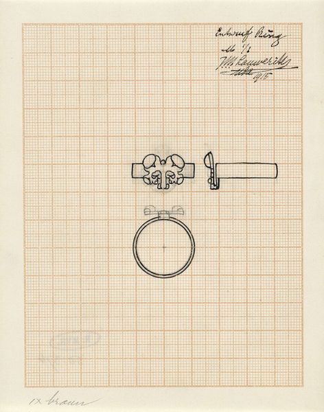
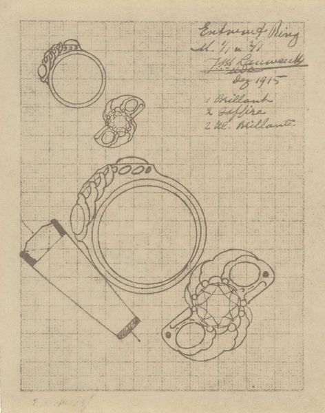
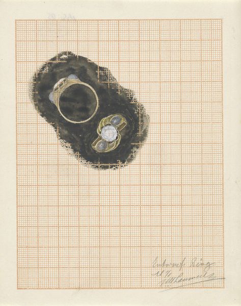
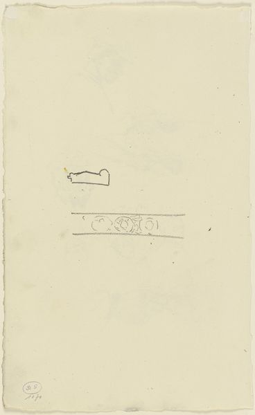
Curator: Here we have Mathieu Lauweriks' 1913 pencil drawing on paper, "Ontwerp voor een ring"—or "Design for a Ring." It's a striking example of Art Nouveau principles. Editor: My initial thought is of constraint and precision. The grid underpinning the organic shapes feels almost like an attempt to control nature, or at least, meticulously plan its expression. Curator: Exactly. Look at how Lauweriks uses the grid not as a cage, but as a modular system. The ring's design incorporates the strict geometry with flowing, curvilinear forms. Consider the contrast; the band's sharp lines lead the eye up to a decorative flourish resembling stylized waves. Editor: That contrast creates tension. The wave-like crest above the ring is almost like a visual pun – suggesting fluidity held in place by rigid convention. I wonder what the envisioned gemstone, implied within the sunburst pattern, symbolizes here? Curator: An olivine, according to the inscription above the design. Olivine, historically, has been linked with protection and inspiration, common Art Nouveau themes. The visual vocabulary throughout his design is clear and carefully thought through. Note how each component echoes the same ratio of circular elements with rectangular form. Editor: Yes, this self-referential aspect heightens the feeling of an insular, symbolic world. The geometric layout coupled with nature-inspired motifs creates an air of mystery—it hints at esoteric knowledge. The sunburst, for instance, might symbolize enlightenment or some kind of spiritual awakening, given the period's interest in Theosophy. Curator: Fascinating connections! And the way the band curves, terminating abruptly? One might argue it denotes a transition, perhaps incomplete. Yet the design is also balanced, almost symmetrical... Editor: Despite the wave form interrupting what might have otherwise been a simpler circular emblem? Precisely! Which makes one wonder what's not represented here, and also points toward the infinite layering and associations of symbolism throughout the design. Curator: This work exemplifies how the most intimate of ornaments can hold sophisticated, layered meanings when considered through the artist's own meticulous process and use of proportional systems. Editor: Indeed! The diagrammatic composition offers a unique glimpse into a designer's method, revealing both precision and artistic reach into symbolism.
Comments
No comments
Be the first to comment and join the conversation on the ultimate creative platform.
More like this