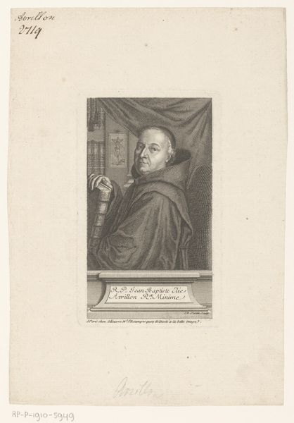
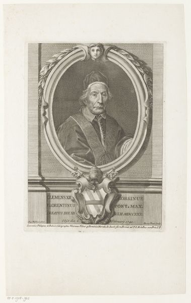
print, engraving
portrait
baroque
old engraving style
personal sketchbook
history-painting
engraving
Dimensions: height 120 mm, width 95 mm, height 229 mm, width 157 mm
Copyright: Rijks Museum: Open Domain
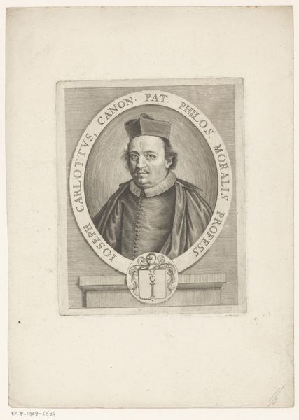
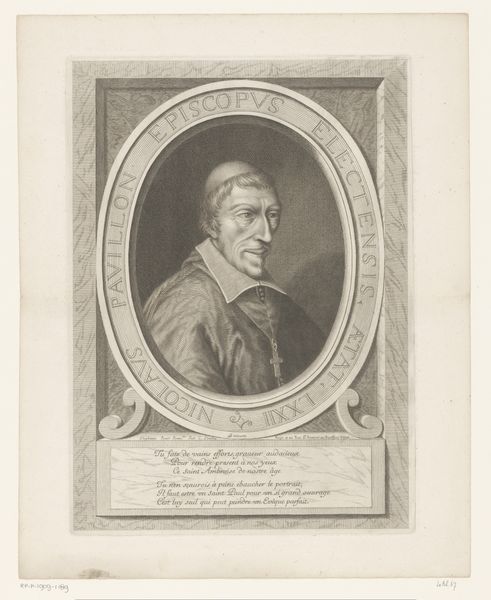
Curator: Oh, my, what a stern gaze! He's judging me, I swear! Editor: Indeed. We’re looking at a print dating back to 1647. The work, titled "Portret van kanunnik Andrea Fossa", which translates to “Portrait of Canon Andrea Fossa,” comes to us courtesy of Giacomo Piccini. Notice the meticulous detail despite being an engraving. Curator: He’s got that Baroque drama down, hasn't he? All that intense, furrowed brow energy, even in monochrome. But I'm immediately drawn to the contrast between the formality of the lettering and the swirling, almost playful frame. It feels… contradictory. Editor: The lettering itself is a study. Look at how it serves not just to label, but to further define the space around the portrait, acting as another frame, really. The swashes and varied font weights guide the eye, while also solidifying the status and gravitas of the subject. It’s typical of the Baroque aesthetic to embed textual elements directly into the visual composition. Curator: Gravitas, yes. You know, I bet he had some amazing stories. Imagine the secrets locked behind those eyes! Is it just me or does he look a bit world-weary, as if he had to put out more fires than he wanted in the Church! Editor: Perhaps. We can certainly read the image as a social and historical artifact. Considering the precision of the engraving technique, it seems designed not just to represent but also to *preserve* a certain image. Look how the lines carve out the details in his face. It's meant to be permanent. Curator: Kind of like a historical snapshot! I appreciate this kind of artwork that lets us imagine other points of view of historical personalities like Mr. Fossa here. And the frame makes me wonder... was this portrait meant to be part of a larger illuminated text? A gift for a patron? Editor: Fascinating to think about its original context. Seeing the layered visual rhetoric at play here reinforces the Baroque intention not merely to depict but to actively persuade and evoke. The whole design emphasizes power, presence, and perhaps even a calculated manipulation of how Andrea Fossa wanted to be perceived by posterity. Curator: He’s still got my attention centuries later, so I’d say his plan worked. Even in this age of infinite scroll and digital frenzy. It kind of reminds me of how we meticulously craft our profiles online now. Perhaps it would not be entirely alien to him. Editor: Precisely, the concerns around image and identity clearly have echoes today, only through a new material language. Thank you for bringing us this wonderful parallel!
Comments
No comments
Be the first to comment and join the conversation on the ultimate creative platform.