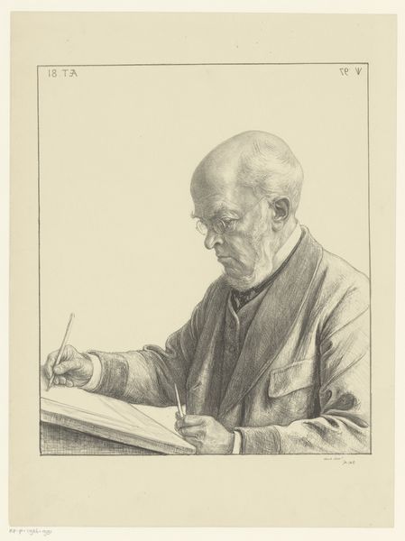
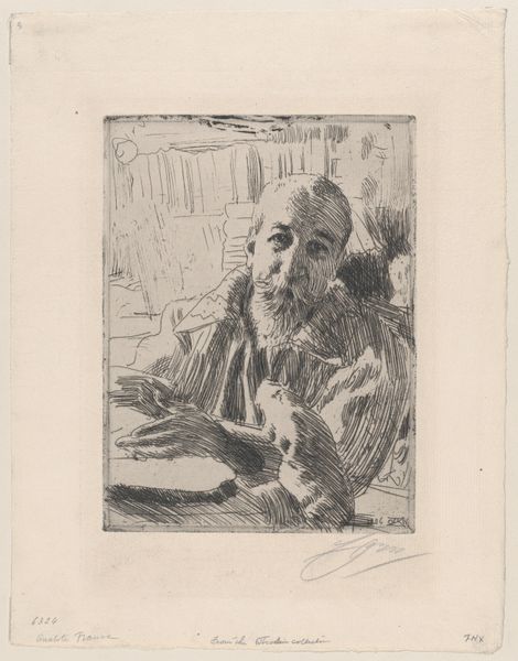
drawing, lithography, lithograph, ink
#
portrait
#
drawing
#
lithography
#
lithograph
#
german-expressionism
#
ink
#
expressionism
Copyright: Public Domain
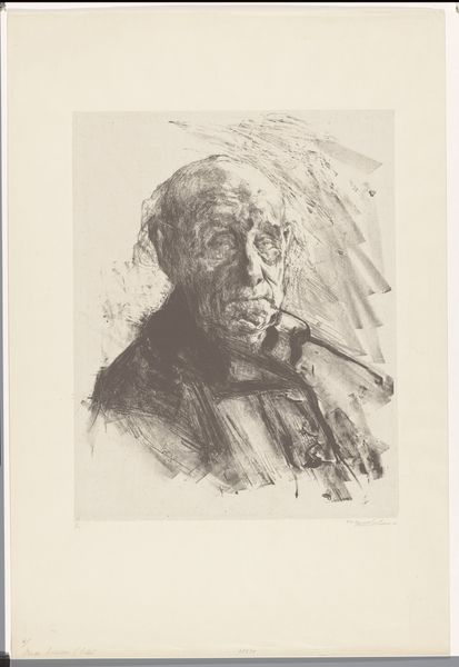
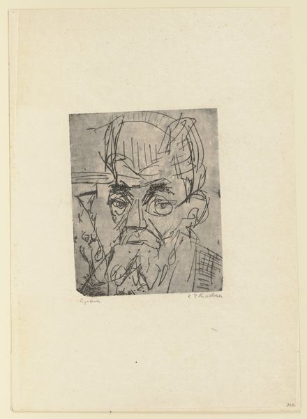
Editor: So, this is Ernst Ludwig Kirchner's 1922 lithograph, "Schiefler," housed right here at the Städel Museum. The strong contrast between the black ink and the white paper really grabs you, doesn’t it? What strikes you most about the composition and technique here? Curator: Note how Kirchner employs lithography to its fullest expressive potential. Observe the marked contrasts and dense clusters of hatching. These build volume and tension without recourse to traditional modelling techniques. Editor: Interesting. So the visual contrast, the use of hatching—those are more important than what the portrait is communicating about the sitter's personality? Curator: One could analyze this work as a system of marks operating within the frame, considering line, texture, and tonal relations. To what extent do you find his likeness to be reliant on those more immediate qualities of surface? Consider how light and shadow fall and guide our eye. Editor: I see your point. I was so focused on the subject that I overlooked how Kirchner builds up the image using marks and shapes rather than smooth tonal transitions. It makes the portrait feel so much more dynamic. The depth created around the background helps too! Curator: Indeed. By understanding how these intrinsic visual elements interrelate, we gain a fuller appreciation for the lithograph's structural integrity, going beyond simple identification or narrative. It seems that the structure, forms, tones and lines really capture how this portrait truly becomes complete. Editor: That is very true, I agree. Focusing on the basic elements really deepened my understanding of the choices he made as an artist in this work!
Comments
No comments
Be the first to comment and join the conversation on the ultimate creative platform.
More like this