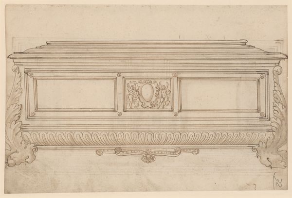
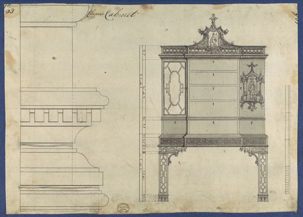
drawing, mixed-media, paper, pen
drawing
neoclacissism
mixed-media
furniture
paper
form
pen
watercolor
Dimensions: height 276 mm, width 413 mm
Copyright: Rijks Museum: Open Domain
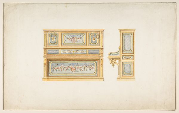
Editor: Here we have Johann Gottlob Fiedler’s “Commode uit de werkplaats van Johann Gottlob Fiedler” from around 1785. It seems to be a mixed-media drawing with pen, ink, and watercolor on paper showcasing a neoclassical style commode. I'm struck by the rigid symmetry, yet also the softness of the color palette. How would you approach interpreting this design, focusing on its form? Curator: I would focus on the formal interplay of lines and shapes. Note how the artist utilizes a geometric structure, evident in the straight lines and right angles, but juxtaposes it with the softer, organic forms of the decorative elements – those carved details, the oval medallions. It's a careful balancing act. Do you see how the color contributes to this effect? Editor: Absolutely. The pale pink softens the strict lines, creating a sense of accessible luxury. It's not as austere as you might expect from neoclassical design. I wonder about the significance of those medallions… Curator: Let's consider them purely as visual components. Notice how their circular shape disrupts the rectilinear grid. This introduces a dynamic contrast, a visual 'pause' that prevents the design from becoming monotonous. Also, consider the placement of shadow and light. How does that inform the perception of depth and volume? Editor: It seems to highlight the three-dimensionality of the piece. It gives form to what is just a 2D sketch of something physical. What do the ornamental flourishes add? Curator: Functionally, nothing. Formally, they elaborate on the essence of neoclassicism. These delicate motifs and curvilinear flourishes create further surface variation by countering severity of line. These details offer a glimpse into the design's philosophical ambitions and a deep sensitivity to formal arrangements. Editor: I see how closely analyzing form reveals so much! Curator: Indeed. Paying attention to the arrangement of shapes, color, and line allows for deeper and varied meaning, even without cultural context.
Comments
No comments
Be the first to comment and join the conversation on the ultimate creative platform.