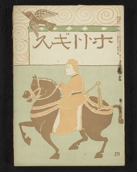
graphic-art, print, poster
graphic-art
art-nouveau
narrative-art
linocut print
symbolism
cityscape
poster
Dimensions: height 1339 mm, width 973 mm
Copyright: Rijks Museum: Open Domain
Editor: This is Eugène Grasset's 1885 poster, "Affiche voor 'Les fêtes de Paris'," a beautiful print. It really strikes me how the flatness of the image contrasts with the implied depth created by the knight and horse. How would you approach an interpretation of this work? Curator: From a formalist perspective, it is intriguing how Grasset navigates the tensions between flatness and depth, line and color, to create a captivating visual experience. Consider the composition. The knight and horse dominate the left side, their forms delineated by strong outlines. On the right, we have a gold panel which provides spatial relief. Editor: So, it’s the relationship between these forms that you find most interesting? Curator: Precisely. Observe how the swirling forms of the horse's tail echo the stylized foliage above, creating a visual rhythm that moves the eye through the composition. The geometric patterns in the borders and the lettering are juxtaposed to organic shapes. Are you seeing any connection between these contrasting elements? Editor: I see how the repeating patterns lend an almost decorative quality, anchoring the image while the figures introduce movement. Curator: Exactly. This deliberate interplay, characteristic of Art Nouveau, manipulates our perception, offering both stability and dynamism. The careful balance of these visual elements results in a harmonious yet stimulating viewing experience. It's in analyzing the interplay of these formal components that we access a deeper understanding. Editor: I understand! By examining how these contrasting elements work together, we can begin to unravel the visual puzzle Grasset presents. Curator: Precisely. The poster isn’t merely a promotional image, but rather, a carefully constructed visual system. Editor: I learned to read it structurally and see it not only in historical context, but primarily in visual terms, for example through contrasting lines and shapes. Curator: Agreed. That is the very point.
Comments
No comments
Be the first to comment and join the conversation on the ultimate creative platform.