#
impressionist painting style
#
possibly oil pastel
#
oil painting
#
earthy tone
#
coffee painting
#
underpainting
#
painting painterly
#
watercolor
#
warm toned green
#
digital portrait
Dimensions: height 310 cm, width 125 cm, depth 3 cm, height 320 cm, width 135 cm, depth 13.7 cm
Copyright: Rijks Museum: Open Domain
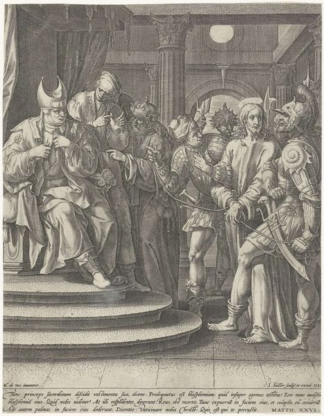
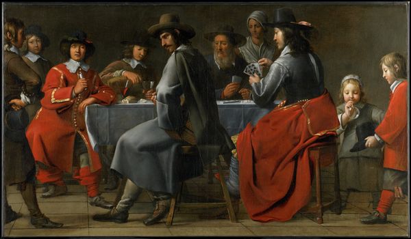
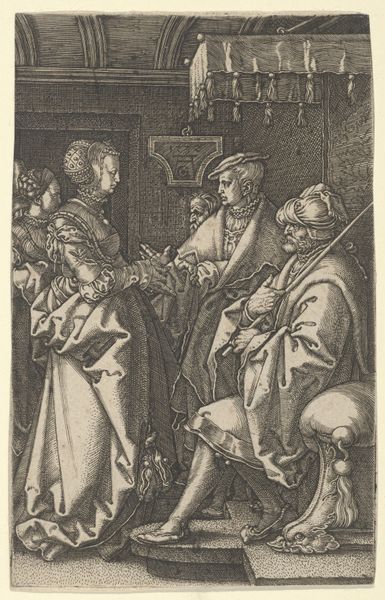
Editor: Here we have Dirck van Delen's "A Seven-Part Decorative Sequence: An Outdoor Stairway," painted between 1630 and 1632. The rigid geometry against the human figures is quite striking to me. How do you approach the analysis of a piece like this? Curator: Formally, consider the relationship between architectural structure and human representation. Observe the use of linear perspective to create depth, how the lines converge and dictate spatial understanding. Do you notice anything peculiar about the architectural rendering? Editor: Well, the precision of the columns and archways is very obvious but they still seem oddly flat against the perspective of the figures and steps, it makes it more dreamlike than I was expecting. Curator: Precisely. Now, focus on the materiality. Note how light interacts with the paint surface. Are there visible brushstrokes? Does the texture contribute to the overall composition? Editor: Now that you mention it, it seems very smooth but with almost an artificial shine to the columns and stairs, versus the softer finish to the subjects of the painting. How does the use of color influence the emotional impact of the painting? Curator: Color functions structurally. Examine the earth tones, the use of light and shadow to define form. It doesn't create warmth so much as depth. Notice how restricted the color palette is? This is not just a portrayal of an outdoor staircase, but an exercise in geometric arrangement of tones. What compositional structures do you observe? Editor: It seems as though the structure dominates the image through its dark colour and scale compared to the more colourful humans that almost feel tacked-on somehow. The overall structure also acts like an internal frame which emphasises the subject that can be seen peering between pillars, making it difficult for your eyes to not follow his line of sight. I wouldn’t have realised these complexities in composition if it wasn’t brought to my attention! Curator: Exactly. Understanding the visual grammar, if you will, allows us a better appreciation of what might otherwise be passed over.
Comments
No comments
Be the first to comment and join the conversation on the ultimate creative platform.
More like this