drawing, typography, pencil
#
drawing
#
art-nouveau
#
script typography
#
hand-lettering
#
hand drawn type
#
hand lettering
#
personal sketchbook
#
typography
#
hand-written
#
hand-drawn typeface
#
geometric
#
pencil
#
typography style
#
sketchbook drawing
#
small lettering
Dimensions: height 103 mm, width 102 mm
Copyright: Rijks Museum: Open Domain
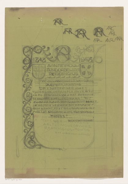
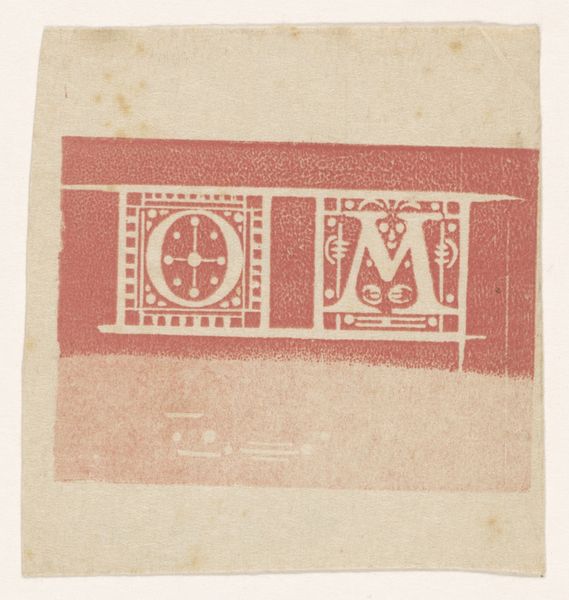
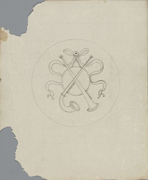
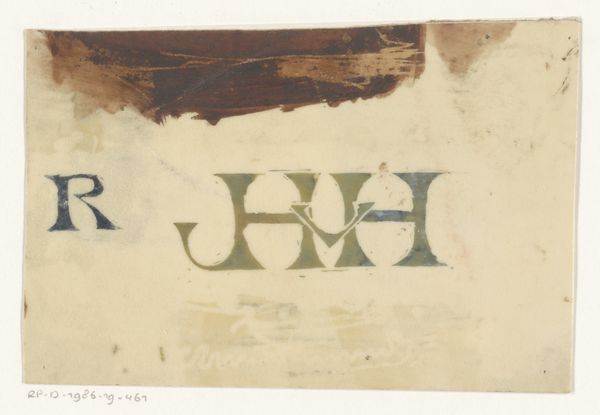
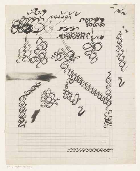
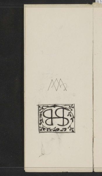
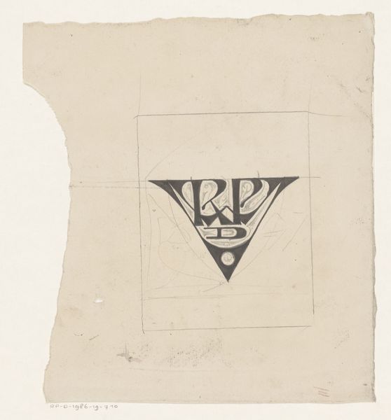
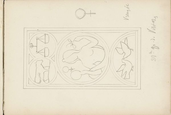
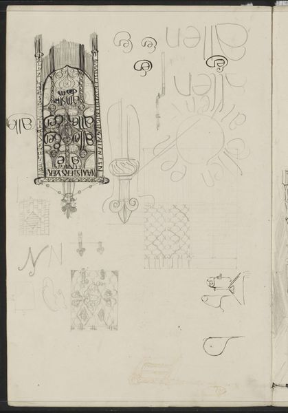
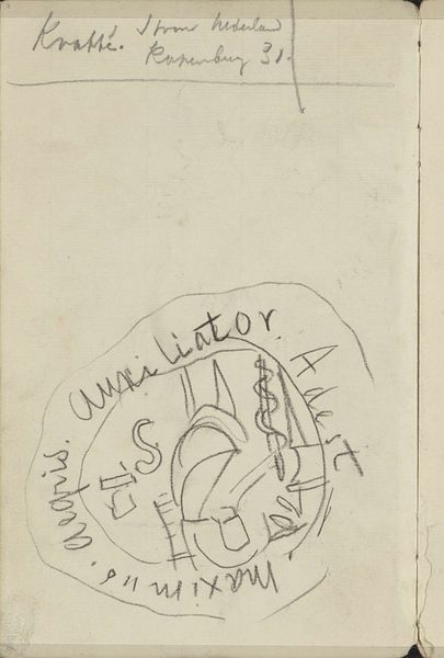
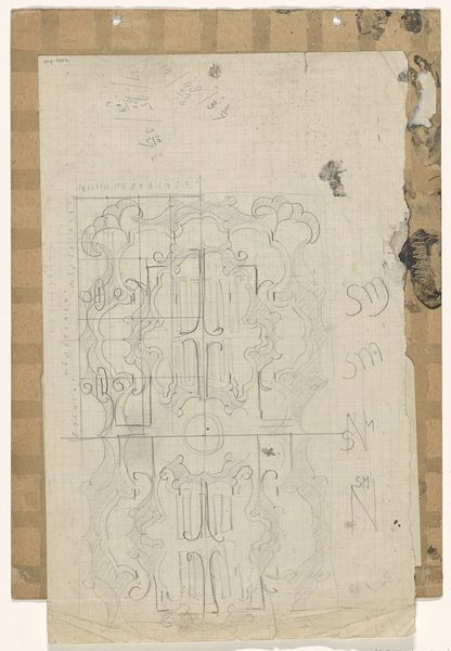
Curator: Gerrit Willem Dijsselhof created this collection of "Ontwerpen voor monogrammen," or Designs for Monograms, in 1920. The work, rendered in pencil, resides here at the Rijksmuseum. Editor: My initial thought is…intimacy. You get such a voyeuristic feel seeing what is essentially somebody's notepad. Look how the artist layers the designs. Curator: Indeed. One immediately notes the interplay between geometric precision and the flowing lines characteristic of the Art Nouveau style. The artist is exploring form, the visual weight and spatial relations in those clustered monograms. It has all the compositional features we observe in that period. Editor: Absolutely! I'd wager this was probably part of some grander design. You can almost imagine the artist muttering to themself, trying to capture the essence of a person through letterforms. There's a wonderful humanness, a tangible sense of searching, even failure…like that messy stroke crossing out the first monogram. It's vulnerable! Curator: Interesting use of language. I believe we observe is the artist refining the essence of design. He engages in that crucial interplay of function and visual delight, creating beautiful yet fundamentally useful forms. There is clear manipulation of space. Editor: The repetition, too, suggests the process is just as important as the product. Perhaps he wanted a personal logo. You imagine him experimenting wildly until each character held his artistic signature, his "brand"… sorry. Curator: Perhaps. It represents something more than merely that "brand". I think this demonstrates that the essence of artistic output relies upon function combined with beauty. He merges craft with high design to achieve something quite aesthetically complex Editor: You know what I appreciate? How raw and unfussy it is. I reckon the simplicity—pencil on paper—highlights how pure design works. These tiny universes encapsulate whole artistic philosophies. Curator: Very true. The intersection between raw, accessible materiality, and the geometric, that yields real power, doesn’t it? Editor: Definitely. It is nice when artists leave breadcrumbs along the creative paths so other makers find that junction themselves. Curator: Absolutely.
Comments
No comments
Be the first to comment and join the conversation on the ultimate creative platform.
More like this